0 members and 1,795 guests
No Members online

» Site Navigation

» Stats
Members: 35,443
Threads: 103,072
Posts: 826,684
Top Poster: cc.RadillacVIII (7,429)
|
-
 Tag stack labeled uncertainty ~Radillac~ Tag stack labeled uncertainty ~Radillac~
I have a few tags that I have mixed feelings about, I kinda like most of them but some have parts that I'm really unsure about.
Let me know what you guys think about them 
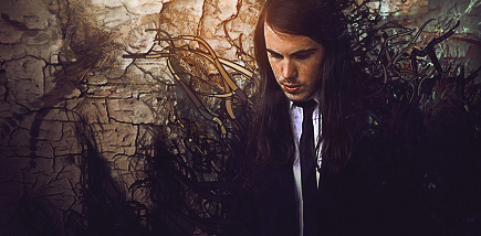
Cults - The good one
Collab with a guy called Mellodude.
His part: http://i.imgur.com/mHpc7.png
My finish:
_________
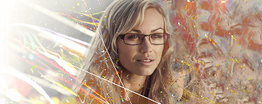
Glasses Brings Sex
I'm in love with the right side (and her of course) but I love hate the left side, it's ugly but at the same time sweet.
_________
Ison & Fille, Swedish rap duo. Not sure if the reality vs vector works that well. One stock with the guys and vector shapes created in Illy, small touch up in PS afterwards.

_________
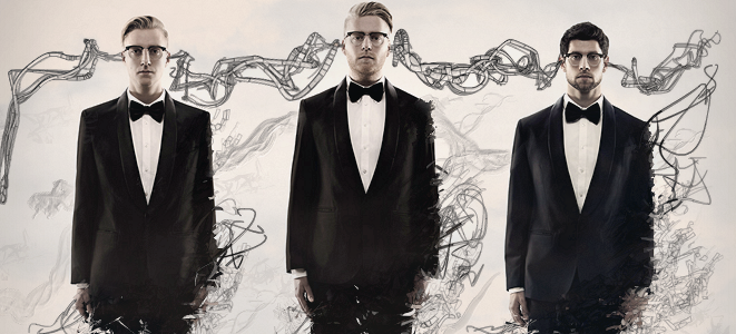
The Swedish group Movits! Their latest album is named "Ut Ur Min Skalle", translated "Out Of My Head". So I took it literally. One stock with the guys and the rest is Rad magic.
I love it, the flow and how I got the effects to blend, at the same time I feel insecure. It's supposed to be grainy at the bottom, that's a part of the retro touch.
__________
Guess that's it for now, hit me hard, low and high, however you may like 
-
nice work with the last two but the third one the stock ends 3/4s to the right. the scribbles on the lower body on the forth one could of been less random like the top half and the stuff on the shoulders aren't need for the middle and left guys.
-
ok ......
nr 1. with him looking down and his hair like it is, i'd make a vertical flow instead of the horizontal that Mellodude choose, but you fixed it nice. good lightning on this one. focal looks lq to me.
nr2. she is pretty indeed!! i think you should go for either left or right.... left side is a tad to bright, and messes here hair.... right side is a bit dull, but i like it better, i'd go for that, and brighten it up a bit...
nr3. hillarious... the two guys and the vectors are dope..... the bg needs to go..... it totally distracts... the guy in the white shirt and the green thing etc..... just remove that
nr4. great stuff. i like what you did with the bottom c4d's.... the long horizontal behind their heads..... hmmm i'd remove that..... or replace them they distract and don't go with the flow...
XL
From scratch, just smudging the XL way
-
 Originally Posted by )85(

nice work with the last two but the third one the stock ends 3/4s to the right. the scribbles on the lower body on the forth one could of been less random like the top half and the stuff on the shoulders aren't need for the middle and left guys.
For the third tag the image were actually this big when I worked on it in Illustrator -> http://img269.imageshack.us/img269/3985/iftag.png But to keep it withing the SOTW size rules and also to show as much of the shapes as possible I decided to crop it outside of the stock, I actually think it helps the flow a bit. I guess it's either a like or dislike thing on that part 
In the 4th I wanted to keep all the guys equal, so they got the same kind of effects. And indeed everything except the head lines are quite random.
Originally Posted by Xelo
ok ......
nr 1. with him looking down and his hair like it is, i'd make a vertical flow instead of the horizontal that Mellodude choose, but you fixed it nice. good lightning on this one. focal looks lq to me.
nr2. she is pretty indeed!! i think you should go for either left or right.... left side is a tad to bright, and messes here hair.... right side is a bit dull, but i like it better, i'd go for that, and brighten it up a bit...
nr3. hillarious... the two guys and the vectors are dope..... the bg needs to go..... it totally distracts... the guy in the white shirt and the green thing etc..... just remove that
nr4. great stuff. i like what you did with the bottom c4d's.... the long horizontal behind their heads..... hmmm i'd remove that..... or replace them they distract and don't go with the flow...
XL
1st Glad to hear that you like what I did and yeah the render is quite LQ >.z
2nd Left is indeed worse than the right. The left side lighting is believe it or not from the woman stock, but at the same time the right side of the face says the light source should come from the right side, so I made it two sources instead. The stock -> http://img18.imageshack.us/img18/573...g1krht2011.jpg
3rd Totally agree about the BG, hurried and were lazy due to SOTW deadline, at the same time it's damn hard to come up with a fitting background for this one 
4th No c4d's used, just this stock and my secret technique http://filialbar.se/wp-content/uploa.../04/movits.jpg The lines behind their heads are actually running through their heads, ear from ear. That's the concept and idea behind it all, Out Of My Head. Removing that would make it really empty and blank + no more concept :[
-
Originally Posted by Xelo
nr4. great stuff. i like what you did with the bottom c4d's.... the long horizontal behind their heads..... hmmm i'd remove that..... or replace them they distract and don't go with the flow...
they look like illy/alchemy/psykopaint stuff idk.
anyway rad, first is pretty cool rest are not up to par with your good stuff.
2nd justuhh way below your level.
3rd render the guy better. it is like deleted around him with soft brush. crop the canvas a lot. make the bg colorful also. and less random vectors
4th idk concept is cool but i'd crop it a lot tbh. maybe make it somewhat colorfull. add some effects.
-
Hehe yeah you're right about the quality of them, that's why I feel so unsure.
You could say that I made the 2nd tag for the sake of using that stock only, rest is just a random history.
3rd yes Illy eraser, lazy that day >.z And I do agree on all that's said.
4th I wanted to keep it sterile whit dull, kinda creamy colors. Effects is a nono, gosh they would look like spacemen.
Thank you for the comment Wr and also forgot to thank 85 and Xelo too!
I need to find my mojo again.
-
First one is good, but feels unfinished. I really like the effects you threw on there.
Second is kinda meh, but again it feels really unfinished. It has potential, but I feel like you might just be better off moving on.
Third one is sick, I'd drop the background though, it's distracting from all the eye candy.
Fourth one I feel could probably be cropped in half. It has better flow without the bottom half. I like the concept, and everything you've done with it.


SOMETIMES I LIKE TO CREATE THINGS
-
Thanks man
I'll try to come up with a better BG for the third this weekend.
I can also try a cropped version of the fourth.
Stay tuned!
-
-
Epic Maze by RadillacVIII


Similar Threads
-
By +Josh Fx in forum Sigs & Manips
Replies: 9
Last Post: 10-29-2010, 10:22 PM
-
By silent_assasin in forum The Void
Replies: 13
Last Post: 10-24-2010, 07:06 AM
-
By Ravon in forum Sigs & Manips
Replies: 1
Last Post: 04-15-2006, 11:26 PM
-
By Lumix in forum Support
Replies: 1
Last Post: 08-10-2005, 04:13 PM
 Posting Permissions
- You may not post new threads
- You may not post replies
- You may not post attachments
- You may not edit your posts
-
Forum Rules
|


 Reply With Quote


