0 members and 3,652 guests
No Members online

» Site Navigation

» Stats
Members: 35,443
Threads: 103,072
Posts: 826,684
Top Poster: cc.RadillacVIII (7,429)
|
-
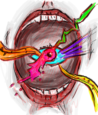
 Hooded (WANT CNC BADLY) Hooded (WANT CNC BADLY)

CnC please. =]
Last edited by Vicious Zen; 01-26-2012 at 03:43 AM.


SOMETIMES I LIKE TO CREATE THINGS
-
the bg colors don't fit with the render's colors, yellow, pink, red in bg, green white and black on render, perhaps adding some hue/sat to the render to colorize it to match your bg, or vice versa. The compo is just dead center, not my fav, but the bg arrows are placed well for some added flow so nice touch there, light effects are cool but the colors again throw it off some, lose the border too  kiu it is def your style vicous zen kiu it is def your style vicous zen
-
Slightly modified. Matched colors a little better (Might do more work on this later) and dropped the border.
I'm not a huge fan of the centered compo, personally, but it worked for the stock, so I figured "why the fuck not?" =B
SOMETIMES I LIKE TO CREATE THINGS
-
Love the style, but it feels like it's missing something, not sure what it could be looking at it honestly as it looks complete but it still has that feeling of being unfinished. Maybe it's just how it goes from being really busy to eh not so much? Idk, not doing any good talking about what I don't what I do now is like Domino said. not huge on the center composition but the arrows helped add flow, my biggest issue is the vectors all look hq, and makes the render look sightly lq. All in all though I dig the style and can see you're comfortable with it, kiu.
-
I think its skill enough to make that render look good xD When I tired it just came out as a horrible dark mess.
Theres quite a bit of empty space but aside from that it looks fantastic, nice and smooth.

One of the sexiest tags I've ever seen, from Radillac ↓ <3
-
I personally have no faults with it.
Other than the fact that the color edit on him has left him looking a little LQ.
-
good work. the effects look pixaled, that could be toned down some and the upper left triangles are somewhat distracting. other then that this look good man.
Similar Threads
-
By Pigler in forum The Void
Replies: 11
Last Post: 10-12-2011, 08:43 AM
-
By Temerity in forum Sigs & Manips
Replies: 9
Last Post: 06-01-2008, 08:55 PM
-
By Elder-Bunny in forum Sigs & Manips
Replies: 2
Last Post: 08-05-2006, 03:56 PM
-
By .:flash:. in forum Support
Replies: 5
Last Post: 06-25-2005, 04:09 PM
 Posting Permissions
- You may not post new threads
- You may not post replies
- You may not post attachments
- You may not edit your posts
-
Forum Rules
|


 Reply With Quote