GFXVoid Graphic Design Forum

Remove Text Formatting
Loading...

» Online Users: 2,207

0 members and 2,207 guests
No Members online

» Site Navigation

 > FAQ

» Stats

Members: 35,443
Threads: 103,072
Posts: 826,684
Top Poster: cc.RadillacVIII (7,429)
Welcome to our newest member, Lekelindids
Page 1 of 2 12 LastLast
Results 1 to 10 of 15
  1. #1
    Join Date
    Aug 2011
    Posts
    36

    Default i run into this problem alot:S!

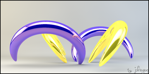
    I have just started playing with ps again (im a beginner still:P) this sig is one of the first times i have tried using c4d's ehich i cant use yet haha as you will see :P but what im trying to point out is that the right side of the sig is real blank and boring and jsut looks crap and im unsure what to out their and i have this case alot ;(


    Yes i know it is not great im just trying to point ous as what to do with the right side for instance, what can i put their! as this happens alot for me thanks.


  2. #2
    Join Date
    Oct 2008
    Location
    Holland
    Posts
    332

    Default

    mess around with the layer options instead of messing around with the opacity.
    I personally prefer Lighten or Screen as the settings.

    Try it out.

  3. #3
    Join Date
    Jan 2012
    Posts
    1,303

    Default

    She seems a little squished in the corner - I would move the render so its not quite that far in there and just work around that. Put C4Ds etc... in the rest of the space.

    One of the sexiest tags I've ever seen, from Radillac <3

  4. #4
    Join Date
    Aug 2011
    Posts
    36

    Default

    I can put c4d's their but when i do it just doesn'y look right


  5. #5
    Join Date
    Jan 2012
    Posts
    1,303

    Default

    Yeah that'll be because the canvas is quite large and the render thin, I would suggest trying a smaller canvas and going for it.

    One of the sexiest tags I've ever seen, from Radillac <3

  6. #6
    Join Date
    Aug 2011
    Posts
    36

    Default

    hmm ok ill give it another shot with it being smaller


  7. #7
    Join Date
    Jan 2012
    Posts
    1,303

    Default

    Her boobs are twice the size of her head. Just saying.

    Not that thats your fault ofcourse =P

    One of the sexiest tags I've ever seen, from Radillac <3

  8. #8
    Join Date
    Aug 2011
    Posts
    36

    Default

    HaHa idd :P


  9. #9
    Join Date
    May 2009
    Location
    Virginia, USA
    Posts
    383

    Default

    I'm assuming you made it so big just to get her boobs into the sig lol but if its a problem with empty space, making the render smaller along with the canvas can help avoid the empty space problem.
    Awesomely Epic Gifty from ChanceB ---V


    Epic gift from Oath xD
    Gift from Agitator Gift from SirenzoGift From AgitatorGift From Stryd3r 9Y0

  10. #10
    Join Date
    Aug 2011
    Posts
    36

    Default

    Yeah im making a new one now with a different stock with smaller canvas should turn out better ill post it when its done


Similar Threads

  1. First to Last. My Improvement. Alot of sigs, ALOT.
    By ejbonagua in forum Member Portfolios
    Replies: 7
    Last Post: 02-19-2011, 05:10 AM
  2. I think I need alot of good CC
    By SuFi B A M F513 in forum Sigs & Manips
    Replies: 9
    Last Post: 08-09-2010, 04:05 PM
  3. Alot of Stocks
    By cC.DOMINO™ in forum Resources
    Replies: 11
    Last Post: 08-26-2009, 08:52 AM
  4. ALOT of new sigs
    By Trikato in forum Sigs & Manips
    Replies: 6
    Last Post: 08-10-2007, 06:58 AM

Posting Permissions

  • You may not post new threads
  • You may not post replies
  • You may not post attachments
  • You may not edit your posts
  •  
Powered by vBadvanced CMPS v4.1.1