GFXVoid Graphic Design Forum

Remove Text Formatting
Loading...

» Online Users: 774

0 members and 774 guests
No Members online

» Site Navigation

 > FAQ

» Stats

Members: 35,443
Threads: 103,072
Posts: 826,684
Top Poster: cc.RadillacVIII (7,429)
Welcome to our newest member, Lekelindids
Results 1 to 6 of 6

Thread: CnC please ;)

  1. #1
    Join Date
    Aug 2011
    Posts
    36

    Default CnC please ;)

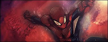
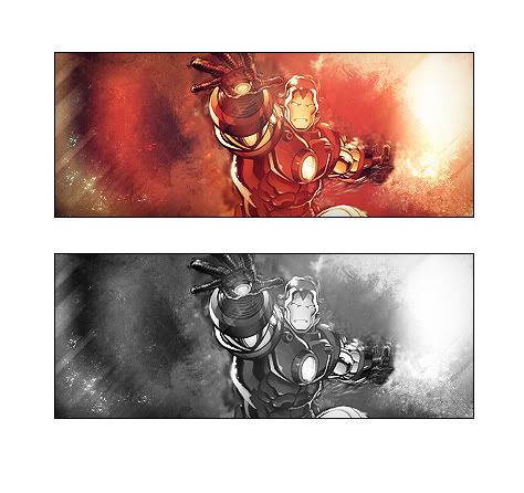
    Just done this sig, i donth think its too bad but i have seen that the blending with the iron mani really messed up on which im pretty annoyed about that but apart from that it looks ok ?


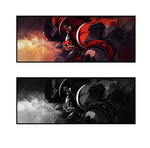
    Just made another so thought id add it

    Last edited by mrstinky127; 01-31-2012 at 02:52 AM.


  2. #2
    Join Date
    Jan 2012
    Posts
    37

    Default

    Image has been removed...

  3. #3
    Join Date
    Aug 2011
    Posts
    36

    Default

    aaa crap my bad ill put them on again


  4. #4
    Join Date
    Mar 2011
    Location
    TN
    Posts
    232

    Default

    I like the spiderman. I'm not all that good at smudging, but i'd say to maybe blend the render better with the background? Also, maybe add a light source?

  5. #5
    Join Date
    Aug 2011
    Posts
    36

    Default

    Yeah i tried adding light to it in the top left but i dont think its that visible + i do need to work on my blending thanks


  6. #6
    Join Date
    Aug 2011
    Posts
    36

    Default

    Just made another one with the same sort of style but im still not too happy with the blending ;( also does then render look to sharp to you or is it just me :P?


Posting Permissions

  • You may not post new threads
  • You may not post replies
  • You may not post attachments
  • You may not edit your posts
  •  
Powered by vBadvanced CMPS v4.1.1