GFXVoid Graphic Design Forum

Remove Text Formatting
Loading...

» Online Users: 980

0 members and 980 guests
No Members online

» Site Navigation

 > FAQ

» Stats

Members: 35,443
Threads: 103,072
Posts: 826,684
Top Poster: cc.RadillacVIII (7,429)
Welcome to our newest member, Lekelindids
Results 1 to 5 of 5

Thread: Progress

  1. #1
    Join Date
    Apr 2009
    Location
    Rosebud, SD
    Posts
    50

    Default Progress


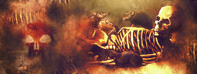
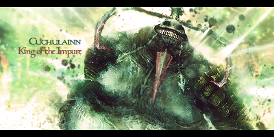
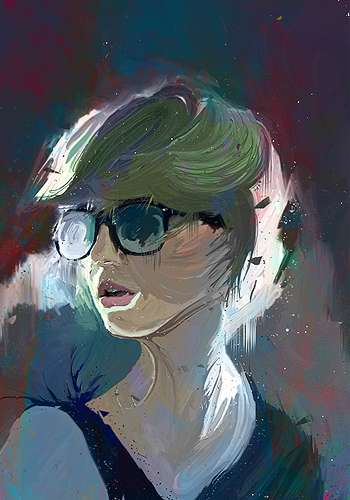
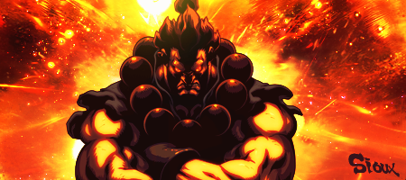
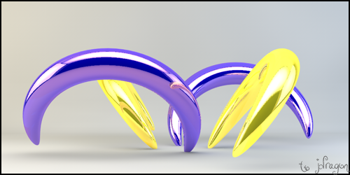
    This was a quick signature I did with a semi cut render of a Magic the Gathering card. I don't know if the guy I made it for will like it but I have gotten a couple small compliments so I am happy. Though, some CnC would be great.


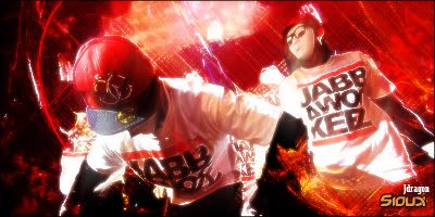
    I shamelessly admit I was inspired by a handful of you advanced folks around here making signatures like this so I figured I should try some humble pie and go outside my comfort zone. Once more, some CnC would be appreciated.


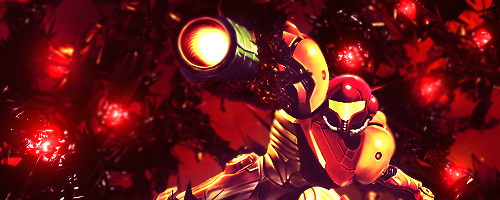
    After tinkering enough with this I think it came out nicely. Once again my gut says the text is unneeded or simply doesn't fit this signature but I did it anyways. I don't know. I think I am making progress. CnC, Pleaseasaurus.


    Thanks be to JDragon for the sweet gift.

  2. #2
    Join Date
    Mar 2010
    Location
    U.S
    Posts
    1,509

    Default

    if the first one had textures it would be pretty cool , right now its a little dull imo , 2nd is over saturated , nice ones kiu
    M y r m i d o n s
    Midnight Marauders
    Plagues
    Kryptic Visons

    KOTH 19winStreak


  3. #3
    Join Date
    Apr 2009
    Location
    Rosebud, SD
    Posts
    50

    Default

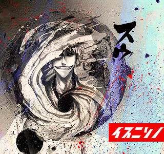
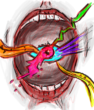
    A little more progress.


    Thanks be to JDragon for the sweet gift.

  4. #4
    Join Date
    May 2009
    Location
    Virginia, USA
    Posts
    383

    Default

    You're definitely showing a good deal of progress, the first one is good but with some grunge work or rust textures I think it could of bumped it up a bit like Liquid said.

    Second you need to really watch the layers and the effects on the overall image since brightness = high contrast. If you can keep it even much better result.

    Third one is probably the best one out of the bunch.

    As far as the other new ones go, I'm not liking them much, you seem to do much better with a smaller canvas then a large one. kiu
    Awesomely Epic Gifty from ChanceB ---V


    Epic gift from Oath xD
    Gift from Agitator Gift from SirenzoGift From AgitatorGift From Stryd3r 9Y0

  5. #5
    Join Date
    Jul 2010
    Location
    Around.
    Posts
    646

    Default

    you're clearly showing progress.
    Third one is clearly the best of the bunch. I'd tighten up the gap in the two rows of text though.


    SOMETIMES I LIKE TO CREATE THINGS


Similar Threads

  1. Tag in progress
    By Trauma in forum Sigs & Manips
    Replies: 5
    Last Post: 09-04-2009, 09:54 PM
  2. In Progress
    By Nightfire in forum Sigs & Manips
    Replies: 19
    Last Post: 10-02-2006, 11:33 AM
  3. In Progress
    By TEXACOTEA in forum Sigs & Manips
    Replies: 2
    Last Post: 08-16-2006, 09:13 PM
  4. Sig in progress (Need some help :) )
    By *JFM* in forum Sigs & Manips
    Replies: 3
    Last Post: 07-04-2006, 10:22 PM
  5. Sig in progress
    By MonChoon in forum Sigs & Manips
    Replies: 3
    Last Post: 03-29-2005, 05:16 PM

Posting Permissions

  • You may not post new threads
  • You may not post replies
  • You may not post attachments
  • You may not edit your posts
  •  
Powered by vBadvanced CMPS v4.1.1