0 members and 4,014 guests
No Members online

» Site Navigation

» Stats
Members: 35,443
Threads: 103,072
Posts: 826,684
Top Poster: cc.RadillacVIII (7,429)
|
-
 New tag! New tag!
I welcome the cnc 
-
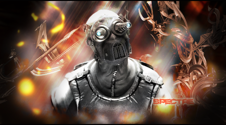
Render is in the middle, #1 no no. Keep Rule of 3rd's in mind at all times. Drop the text, ruins the tag. Try to blend in your render more with the bg, I can see your attempt but read some tuts on how to improve it. Also your color choice is a bit off, the render uses grays, black, and cyan, and you used brown red and orange in your bg.. most of your fx are in the bg, use some in the fg to create some depth. also your "light rays"are coming in top right to bottom left, if you look at your render light is coming from topp to bottom, so that has to be fixed. fix colors, lighting. create depth and better fx , drop the text and this tag will look good
-
thank you for the feed back, much appreciated  also I would really like to have text in my sig, have any good tuts you can link me to so I can learn a better text technique, also yeah i see what you're saying about the blending and color, thank you again. also I would really like to have text in my sig, have any good tuts you can link me to so I can learn a better text technique, also yeah i see what you're saying about the blending and color, thank you again.
-
They say what goes up must come down but,
Don't let me fall
Latest Work
-
text is one of the hardest things to do right in GFX. thats why i avoid it. :] i can't help you with text, what it really is is blending the text. that's the hard part.
-
lowering the opacity a little bit is good ^_^
They say what goes up must come down but,
Don't let me fall
Latest Work
-
hell yeah guys! thanks for the great tips, I'm really motivated to get this tag done right 
-
Work on your blending, some c4ds dont seem placed right, i mean nice job on trying to have some flow but they dont blend. Work on that 
Also fix the lighting, its to bright while the corners are black, darken the render a bit lower the lighting 
 Posting Permissions
- You may not post new threads
- You may not post replies
- You may not post attachments
- You may not edit your posts
-
Forum Rules
|


 Reply With Quote


