0 members and 3,309 guests
No Members online

» Site Navigation

» Stats
Members: 35,443
Threads: 103,072
Posts: 826,684
Top Poster: cc.RadillacVIII (7,429)
|
-
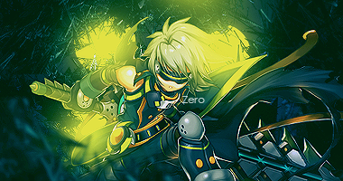
 Zero Zero
-
Not too bad, not too bad.
Even tho, there are things you should fix in your sig.
First of all, one of the most important things: focal. For me, the focal is the leg and his sword and cape at the right hand side, rather than his head, for example. You should fix that.
Then, the yellow color in the background stands out too much for me. And the rest of the background looks a bit too plain and with a low quality.
Its quite hard to explain, because this sig looks kinda good and bad at the same time.
Also, I would place the text somewhere else, maybe put some effects on it. It would cool.
Also, I noticed that you put sharpening in the spots you shouldnt. Most of the time, sharpening fits on the focal and gaussin blur on the sides.
Anyway, over it doesnt look bad, but needs some details and some obvious errors fixing..
Cheers!! Have a nice weekend.
-
This would look better textless. If you want to keep the text, lemme know and I'll give you some tips.
My favorite work of mine:
 SOTW stats: Entries: 2 Wins: 0 Second place: 0 Top 3: 0 Top 5: 1
-
Thanks
@GarisThat was one very descriptive Cnc and I love that about this place, thanks.
@damien Text is my weak point and I would love some text advice and tips.
-
1: Keep it simple. A nice helvetica or arial black could go a long way.
2: Make sure the text blends in. I always put my text one layer above my render.
3: Text placement is extremely important. If you want the text to be an important part of the sig, put it over the render. If you want it to be a minor part, keep it off the render, but then good placement in this case is difficult.
4: If you're using big text, try to experiment with subtle gradients and offset text (as in, duplicating a body of text, changing the color of the bottommost text layer, and offsetting it slightly, like here: http://i152.photobucket.com/albums/s.../lynchwip2.png).
My favorite work of mine:
SOTW stats: Entries: 2 Wins: 0 Second place: 0 Top 3: 0 Top 5: 1
 Posting Permissions
- You may not post new threads
- You may not post replies
- You may not post attachments
- You may not edit your posts
-
Forum Rules
|


 Reply With Quote


