V2:
I prefer the first, although the second looks really 3d to me xD Really love the style you've got going on there.
One of the sexiest tags I've ever seen, from Radillac ↓ <3 Website: http://www.anibass.co.uk
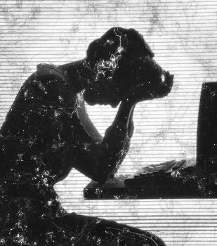
I like the first one, its perfect but to dark the second one is a joke jk but you need to work on smudging.
The focal being almost centered hurts me, very nice though.
Corrupt's gift| Liquid's gift
tnx everybody
I like it.... the first one. second one isn't sharp.
From scratch, just smudging the XL wayGIFTS: GiftmapACHIEVEMENTS: Scribble's Artist of the Week #2 - SpiderAttackSOTW#204 - Architecture SOTW#340 - Journey
Not a huge fan of it, but I don't really like B/Ws much unless they're in a very smooth style.
My favorite work of mine: SOTW stats: Entries: 2 Wins: 0 Second place: 0 Top 3: 0 Top 5: 1
Forum Rules


 Reply With Quote


 jk but you need to work on smudging.