0 members and 521 guests
No Members online

» Site Navigation

» Stats
Members: 35,443
Threads: 103,072
Posts: 826,684
Top Poster: cc.RadillacVIII (7,429)
|
-
-

Colored version IMO.
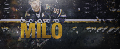
I like the text, it really works here. However, I think you should move it left ~30 pixels and crop off some of the right. The lighting next to the render is also too strong and takes the eye away from it. The sig looked washed out but it works well here. Nice job.
My favorite work of mine:
 SOTW stats: Entries: 2 Wins: 0 Second place: 0 Top 3: 0 Top 5: 1
-
Very nice sig, like above I much prefer the colour version. The main thing that stood out to me though was the lighting, you have a great command of it, but its not in the right place - like in this, its main lightsource is the colour on the sword whereas the light reflecting on the stocks face is coming from the right.
Overall though nice tag!

One of the sexiest tags I've ever seen, from Radillac ↓ <3
Similar Threads
-
By xSorrow- in forum Sigs & Manips
Replies: 2
Last Post: 09-15-2011, 05:46 PM
-
By cc.mio in forum Sigs & Manips
Replies: 14
Last Post: 06-26-2010, 07:49 PM
-
By Godreas in forum Sigs & Manips
Replies: 3
Last Post: 08-15-2008, 10:18 AM
-
By elixile in forum Sigs & Manips
Replies: 10
Last Post: 08-13-2008, 07:45 AM
-
By Aristodemus in forum Sigs & Manips
Replies: 9
Last Post: 06-24-2008, 06:55 PM
 Posting Permissions
- You may not post new threads
- You may not post replies
- You may not post attachments
- You may not edit your posts
-
Forum Rules
|


 Reply With Quote
