GFXVoid Graphic Design Forum

Remove Text Formatting
Loading...

» Online Users: 2,458

0 members and 2,458 guests
No Members online

» Site Navigation

 > FAQ

» Stats

Members: 35,443
Threads: 103,072
Posts: 826,684
Top Poster: cc.RadillacVIII (7,429)
Welcome to our newest member, Lekelindids
Results 1 to 4 of 4
  1. #1

    Default New Speed Art for a Contest

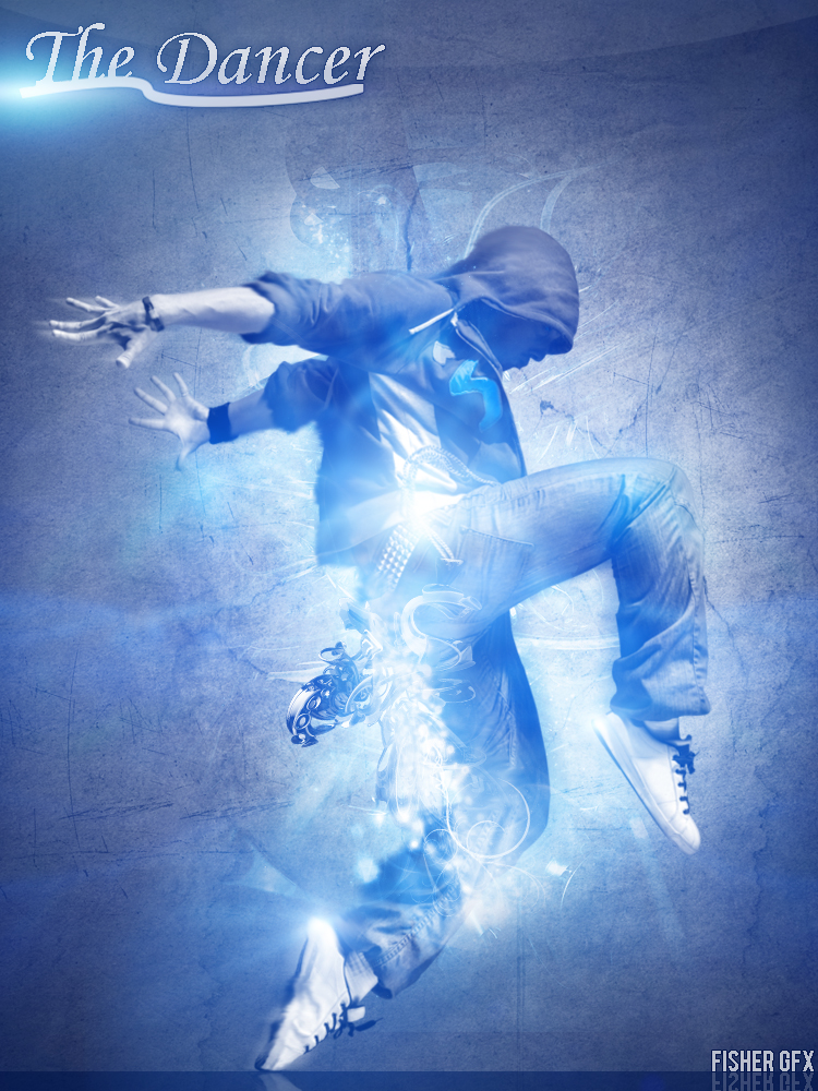
    This is my first serious speed art that iv'e took time on this is for "LightningDesignsHD Contest's" contest so please check it out and give me some feedback please
    Thanks FisherGFX


    Final Image -


  2. #2

    Default

    Needs a lot of work mate.

    - Bad Font Choice
    - Lighting is a bit weird...
    - No Contrast.
    - Low Quality.
    - Background work is nice, but the c4d behind him, kind of ruins the piece for me.
    Proud Owner of:
    RichFlyers
    Skype: NovruzeliHuseynov


    ^ LOVE YOU RAD ^


  3. #3
    Join Date
    Mar 2009
    Posts
    2,831

    Default

    looks like the c4d is coming out of his backside. doesn't fit, but like kronik said the text is lq, but the lighting and effects are cool kiu.

  4. #4

    Default

    Thanks for the feedback

Similar Threads

  1. Need for speed
    By Downfall in forum Sigs & Manips
    Replies: 4
    Last Post: 11-23-2010, 03:51 AM
  2. Need for Speed
    By Necrothalass in forum Sigs & Manips
    Replies: 3
    Last Post: 11-03-2010, 07:37 AM
  3. You wish you had my DL Speed.
    By Sirlock in forum The Void
    Replies: 10
    Last Post: 09-07-2010, 07:35 PM
  4. Speed
    By Quicktime in forum Digital Art
    Replies: 11
    Last Post: 06-21-2005, 10:56 AM

Posting Permissions

  • You may not post new threads
  • You may not post replies
  • You may not post attachments
  • You may not edit your posts
  •  
Powered by vBadvanced CMPS v4.1.1