0 members and 746 guests
No Members online

» Site Navigation

» Stats
Members: 35,443
Threads: 103,072
Posts: 826,684
Top Poster: cc.RadillacVIII (7,429)
|
-
 Dont go into the light Dont go into the light
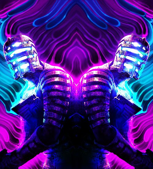
Heres a nice sig i threw together, plz CnC
Original

With Text

-
-
ya, well atleast you were helpful and polite. Guys on my other forum just ragged on how absolutely horrible it was :\
-
Nah whats the point of being rude to some one who is just getting started with Graphics ???.....
Skype: NovruzeliHuseynov

^ LOVE YOU RAD ^
-
Sorry to hear that people were rude to you. There's no reason to act mean towards someone starting out in designing. After all, we were all new at one point. Shniper, go read up on some tutorials. They'll help you out big time and if you make more signatures, post them here for us to give you tips on how to improve.
-
 Originally Posted by Shniper1337

Heres a nice sig i threw together, plz CnC
Original
With Text
When blending a soft eraser doesn't often work. Try to use gradient maps to colour blend the subjects too.
I think the guy you chose is a hard render to work with, game characters and usually easier.
As for fonts simple sans fonts are often the way to go. Space them closer together too.
Similar Threads
-
By `Knight in forum Sigs & Manips
Replies: 0
Last Post: 08-19-2011, 08:56 PM
-
By exclusive in forum Sigs & Manips
Replies: 6
Last Post: 07-11-2011, 08:42 PM
-
By ejbonagua in forum Sigs & Manips
Replies: 2
Last Post: 10-25-2010, 07:10 AM
-
By exclusive in forum Sigs & Manips
Replies: 6
Last Post: 10-20-2010, 10:39 AM
-
By Riddleb0x in forum Sigs & Manips
Replies: 3
Last Post: 12-11-2006, 03:24 PM
 Posting Permissions
- You may not post new threads
- You may not post replies
- You may not post attachments
- You may not edit your posts
-
Forum Rules
|


 Reply With Quote