0 members and 1,855 guests
No Members online

» Site Navigation

» Stats

Members: 35,443
Threads: 103,072
Posts: 826,684
Top Poster: cc.RadillacVIII (7,429)
|
-
-

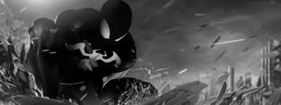
Looks cool. The positioning is good, i like the way it blends with the c4ds, but it looks too dark. Try to lighten it up a bit.
PS. Don't listen to me, im a noob.
-

wow man, big iprovement from your other tags  nice. Keep it Up. nice. Keep it Up.
- Lighting is there, which is important
- You did make it too dark, try bringing up the brightness of the tag
- That purple thing on the side ??? of the render what is it ??? get rid of it...
- Oh and looks a bit low quality, try sharpening and messing with your curves.
- KiU
Skype: NovruzeliHuseynov

^ LOVE YOU RAD ^
-

Too many effects going both sides, messes up the flow.
to have better idea how the effects should be used to make it flow take a look at the render, e.g. the tie (top left to bottom right), align with it.
Also don't place all the effects behind the render, put some on top to blend it better and add more depth.
Ps: spend more time in the process, don't rush it.
The whole idea is learning through experience, so mess around with different filters and tools. Even if the signature turns out bad at least you'll have an idea how certain filters and tools could make the difference later with other one of your works.
Stay inspired.
Last edited by Lew; 04-06-2012 at 09:13 AM.
-

 Originally Posted by +s9.KroniiK

- That purple thing on the side ??? of the render what is it ??? get rid of it...
ya i went through all 23 of my layers (though alot were just gradient maps set to overlay or soft light etc. and it apparently didnt belong to any o.O
Too many effects going both sides, messes up the flow.
to have better idea how the effects should be used to make it flow take a look at the render, e.g. the tie (top left to bottom right), align with it.
Also don't place all the effects behind the render, put some on top to blend it better and add more depth.
Ps: spend more time in the process, don't rush it.
The whole idea is learning through experience, so mess around with different filters and tools. Even if the signature turns out bad at least you'll have an idea how certain filters and tools could make the difference later with other one of your works.
Stay inspired.
i actually did add some above him, but i was going for that sort of broken/explosive kind of effect, and the c4d used got thicker the further in so i didnt want to make it too far over him. also the colors sorta blend in with him which i guess i could have done better with.
Also i didnt really rush, the render was very clean and i found it easy to work with, + i used aboout 3 different c4ds but alot of duplicated layers 
the gradient mapping part (constructive layers i think its called) was the part that took awhile because i was trying to use my light source to naturally sharpen the render. I think it worked out, but could be a little less dark on the left, thanks for your feedback

"You come to love not by finding the perfect person, but by learning to see an imperfect person perfectly"
-

 Originally Posted by Shniper1337

Also i didnt really rush
I only asumed you did so because you said it took you 20-30 minutes.
It usually takes an hour more or less for me to develop an half decent signature.
My bad mate.
-
-

I've never really seen any of you other sigs but if you have a improved there are still areas in that need improvement in the sig. I feel as if its very dull but the lighting is there; however, you could make the colors a bit more crisp. try messing with the curves and levels. you should also try working on depth a bit since there is an attempt being made to blend in the background effects with the foreground. Otherwise keep it up you do understand the basics from what it looks like.

My Three Rules Of Making a Sig Flow, Lighting and Depth
Similar Threads
-
By Dron in forum Sigs & Manips
Replies: 4
Last Post: 06-16-2009, 12:51 PM
-
By Quaggy in forum Sigs & Manips
Replies: 4
Last Post: 06-29-2007, 09:31 AM
 Posting Permissions
- You may not post new threads
- You may not post replies
- You may not post attachments
- You may not edit your posts
-
Forum Rules
|


 Reply With Quote


 nice. Keep it Up.


