0 members and 715 guests
No Members online

» Site Navigation

» Stats
Members: 35,443
Threads: 103,072
Posts: 826,684
Top Poster: cc.RadillacVIII (7,429)
|
-
-

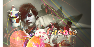
Text is really really nice and the effect on the left but i'm not digging those stripes on the right side and what's up with the light source on top? Move it a bit to the right.
Other that that it looks pretty good.
Great job mate.
Last edited by Lew; 04-06-2012 at 08:39 AM.
-
i really like this, i agree wit lew about the text butt quite the opposite about the rest, i really like the lines coming from the spray can but the effects at the bottom look thrown together in my opinion
but dont listen to me im a noob lol
"You come to love not by finding the perfect person, but by learning to see an imperfect person perfectly"
-
-
Similar Threads
-
By Scrib in forum Digital Art
Replies: 17
Last Post: 01-05-2010, 10:21 AM
-
By SSJTrunks2004 in forum The Void
Replies: 19
Last Post: 06-05-2005, 06:41 PM
-
By Dale in forum Battlegrounds
Replies: 40
Last Post: 02-22-2005, 02:25 PM
 Posting Permissions
- You may not post new threads
- You may not post replies
- You may not post attachments
- You may not edit your posts
-
Forum Rules
|


 <3ty ase
 Reply With Quote