GFXVoid Graphic Design Forum

Remove Text Formatting
Loading...

» Online Users: 6,083

0 members and 6,083 guests
No Members online

» Site Navigation

 > FAQ

» Stats

Members: 35,443
Threads: 103,072
Posts: 826,684
Top Poster: cc.RadillacVIII (7,429)
Welcome to our newest member, Lekelindids
Results 1 to 8 of 8
  1. #1
    Join Date
    Dec 2011
    Location
    Latvia
    Posts
    48

    Exclamation Pick Me Up | Dual Speed Art | SanityDZN & aCookieGFX

    A dual speed art between me and SanityDZN (on youtube). Please leave feedback!
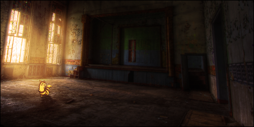


    Final Image:

  2. #2
    Join Date
    Dec 2011
    Location
    Latvia
    Posts
    48

    Default

    No feedback? :E

  3. #3

    Default

    It looks amazing
    Proud Owner of:
    RichFlyers
    Skype: NovruzeliHuseynov


    ^ LOVE YOU RAD ^


  4. #4
    Join Date
    Dec 2011
    Location
    Latvia
    Posts
    48

    Default

    Quote Originally Posted by +s9.KroniiK View Post
    It looks amazing
    Last edited by aCookieGFX; 06-14-2012 at 02:26 PM. Reason: derp

  5. #5
    Join Date
    Jan 2012
    Location
    CA
    Posts
    393

    Default

    I'd say it was a strong idea, but not executed properly.

  6. #6
    Join Date
    Jun 2010
    Location
    ....
    Posts
    98

    Default

    Very creative... And it looks sick as fuck to me.

    F U R R E T

  7. #7
    Join Date
    Dec 2011
    Location
    Latvia
    Posts
    48

    Default

    Quote Originally Posted by .Void View Post
    I'd say it was a strong idea, but not executed properly.
    So what would you suggest to improve it?

  8. #8
    Join Date
    Jan 2012
    Location
    CA
    Posts
    393

    Default

    Quote Originally Posted by aCookieGFX View Post
    So what would you suggest to improve it?
    Well, watching the video it looked like you trying to make it look like the black stuff was pulling her down or just kind of grabbing her and created a bg that looked nice imo, but went too far with everything and it ended up looking kind of messy in the end. So, just going back to what you started with and not going overkill and keeping the piece evened out would be my suggestion. Just my opinion, don't shoot me.

Similar Threads

  1. KOTH Scrib vs. aCookieGFX
    By cC.DOMINO™ in forum KOTH Voting
    Replies: 5
    Last Post: 03-31-2012, 12:57 AM
  2. Dual layer DVD's
    By Wolverine in forum The Void
    Replies: 5
    Last Post: 01-24-2006, 03:30 PM
  3. Final Dual
    By Ac1d in forum Digital Art
    Replies: 3
    Last Post: 06-25-2005, 07:35 PM
  4. another one...dual gavels
    By Haven in forum Sigs & Manips
    Replies: 9
    Last Post: 04-06-2005, 05:30 PM

Posting Permissions

  • You may not post new threads
  • You may not post replies
  • You may not post attachments
  • You may not edit your posts
  •  
Powered by vBadvanced CMPS v4.1.1