0 members and 3,114 guests
No Members online

» Site Navigation

» Stats
Members: 35,443
Threads: 103,072
Posts: 826,684
Top Poster: cc.RadillacVIII (7,429)
|
-
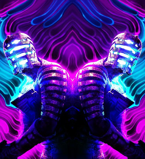
 I swear I'm spamming this forum. Submission for KOTH, need feedback. I swear I'm spamming this forum. Submission for KOTH, need feedback.
Last edited by Dolce; 07-02-2012 at 08:41 AM.
-
-
/\ Agreed. Amazing. Your lightning skills are impressive.
From BuBBlez
-
Lovely piece. Though I think I can help you get a little closer to KOTH ^^
See his sparks, take a black layer put it on colour dodge, then with a redish/pink/purple we colour you wish, get a soft or hard ( depending on what you like better for effect) and on ver low opacity on bursh go ahead and enhance the colour and flow with it, play around with attempting to make a more dramatic effect via sparks/smoke/swirls and continue to add as desired, showing depth this way with your effects will greatly entertain the present effects you already have on here.
As stated your lighting is impressive, though I feel his back leg is too light for your impression of depth/lighting. Go ahead and lightly dust that up a little more with black so that it more gradually falls into the background.
Keep going, I'm sure you will love it we you do with it ^^
 Radi's one of a kind gift <3
 ^My Wish List^

-
Agreed absolutely stunning.
May one can haz render? xD

One of the sexiest tags I've ever seen, from Radillac ↓ <3
-
Hey, was gone for the weekend sorry. I appreciate the C&C!
I totally agree his one leg was too focal, I had fixed that in another copy, but forgot to change it in this one.
I also -tried- to do what you suggested with the color burnt dots... I use that technique to achieve color-specific lighting in a lot of cases, I had already used it on lower layers in this sig, but I tried it again to see if it would look okay.
Top post is updated.
Also added render, since it was asked for.
Last edited by Dolce; 07-02-2012 at 08:42 AM.
Similar Threads
-
By Scottyy in forum Sigs & Manips
Replies: 4
Last Post: 02-21-2012, 08:35 PM
-
By uHbuv in forum Sigs & Manips
Replies: 3
Last Post: 01-14-2012, 08:30 AM
-
By Interrobang in forum Sigs & Manips
Replies: 1
Last Post: 11-26-2010, 01:43 AM
-
By Sparda in forum Sigs & Manips
Replies: 2
Last Post: 03-17-2010, 02:04 PM
-
By diabloUNDERWRLD in forum Sigs & Manips
Replies: 4
Last Post: 07-16-2009, 04:01 PM
 Posting Permissions
- You may not post new threads
- You may not post replies
- You may not post attachments
- You may not edit your posts
-
Forum Rules
|


 Reply With Quote