0 members and 515 guests
No Members online

» Site Navigation

» Stats
Members: 35,443
Threads: 103,072
Posts: 826,684
Top Poster: cc.RadillacVIII (7,429)
|
-
 new SIG.. new SIG..
 
just finished another...
c/c please...
Last edited by dillinger; 06-29-2012 at 06:08 PM.
-
work better on the lightning. see some tutorials and your sigs could've turned out better. the first one has potential. P.S. impressive internet speed, i can barely get 1 mb/s of internet at my house. -.-
From BuBBlez
-
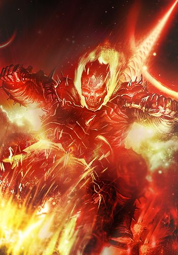
Flashie boobies 
I would say good use in colours and good try with the renders. Using them to help fill space is always a good choice.
There is always though the idea of just stealing some colours from your focals and enhance areas with it.
Your worst set up is your flow imo, use your focal to show you the path! Your dude one is leaning to the left, causing a nice top left to bottom right, this is your "natural path" focus on trying to get the effects and eye view to move that same way and you will find more flow and easier motion to work that way.
Your girl one could use some work with filler, wicked colours again, though you are not utilizing the atmosphere with the effects given, she has blue firse !! use it, good way to go about it is to get some fire or smoke stocks, play with the hue/sats on them and help it curve the idea in your piece. Don't be afraid to try new resources to capture the attention of your viewers!!!
kiu I think you have some potential ^^
 Radi's one of a kind gift <3
 ^My Wish List^

-
60 meg i have,get this on my laptop,and ty for the c/c...
-
ty for the c/c,will keep trying...
 Posting Permissions
- You may not post new threads
- You may not post replies
- You may not post attachments
- You may not edit your posts
-
Forum Rules
|


 Reply With Quote
