0 members and 272 guests
No Members online

» Site Navigation

» Stats
Members: 35,443
Threads: 103,072
Posts: 826,684
Top Poster: cc.RadillacVIII (7,429)
|
-
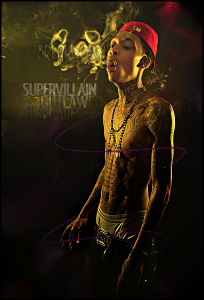
 Wiz Khalfia Wiz Khalfia
-
Great job playing with the pen tool, this tool is one of the best found in Ps imo and could cover some great ground in many different ways. I saw continue to attempt to use the pen tool and test the waters more. So far you are getting the idea of the bend and curves, making it look smooth and fluid. Good job, that takes a while ^^
Your text in the smoke is not needed, you already have good placement in the other text and good effect, the other text just kills the detail and attention.
Your shading of this piece is helpful to draw attention to the face and gives great help.
Although I did congratulate you on the pen work, in this case it's not working well. Simple because of the colour used and the brush that was applied, I would suggest even trying to put this layer on lineare dodge or something, but still I would change the colour to an orange, this colour coming from your other colours in this piece.
keep playing with the tools, you will only learn by trial and error 
 Radi's one of a kind gift <3
 ^My Wish List^

-
 Originally Posted by Slave

Great job playing with the pen tool, this tool is one of the best found in Ps imo and could cover some great ground in many different ways. I saw continue to attempt to use the pen tool and test the waters more. So far you are getting the idea of the bend and curves, making it look smooth and fluid. Good job, that takes a while ^^
Your text in the smoke is not needed, you already have good placement in the other text and good effect, the other text just kills the detail and attention.
Your shading of this piece is helpful to draw attention to the face and gives great help.
Although I did congratulate you on the pen work, in this case it's not working well. Simple because of the colour used and the brush that was applied, I would suggest even trying to put this layer on lineare dodge or something, but still I would change the colour to an orange, this colour coming from your other colours in this piece.
keep playing with the tools, you will only learn by trial and error
Thanks so much man!
-
Text is not needed. I ruins it. I tend to do it too. Text equals a very shitty thing to handle with.
-
I really love it bud, it looks really 3D in my eyes for some reason. Great colour work!

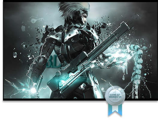
One of the sexiest tags I've ever seen, from Radillac ↓ <3
 Posting Permissions
- You may not post new threads
- You may not post replies
- You may not post attachments
- You may not edit your posts
-
Forum Rules
|


 Reply With Quote

