0 members and 478 guests
No Members online

» Site Navigation

» Stats

Members: 35,443
Threads: 103,072
Posts: 826,684
Top Poster: cc.RadillacVIII (7,429)
|
-
-

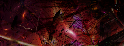
it's bad. first you have to learn on how to make a good sig with a render or a stock, then you may try to make an abstract sig.
From BuBBlez
-

Ive made more than 100 sigs bro, this was my first abstract try and i didnt fix it up or anything, i just added some wireframes and c4ds and moved them around. No CC or anything, just a basic first attempt. Also if your going to say its bad u better damn well be prepared to tell me why or dont comment at all
"You come to love not by finding the perfect person, but by learning to see an imperfect person perfectly"
-

you posted your sig here, you have to deal with the critique. you may not accept or not accept it. it's your choice. i can help you if i choose to. you're being rude. i say it is bad because it looks like you made a red background and then added c4ds and wireframes only. try to work on the colours and go watch some tutorials.
From BuBBlez

-

 Originally Posted by h3rald

you posted your sig here, you have to deal with the critique. you may not accept or not accept it. it's your choice. i can help you if i choose to. you're being rude. i say it is bad because it looks like you made a red background and then added c4ds and wireframes only. try to work on the colours and go watch some tutorials.
Posting "It's bad" isn't critiscism! It's your personal opinion.
Look up CONSTRUCTIVE criticism!
-

I personally kind of agree with h3rald, and I think you're taking it poorly, Shniper.
He didn't JUST say it was bad, he said you need to practice using a simpler focal point, like a render.
I looked through your previous posts at your "1000s of tags", and you're not some professional graphics artists. You have some good tags, but looking at stuff like previous smudge work you've done, and even your tags with renders, you still need to work on lighting/depth/composition.
The reason we say this is that when you do an abstract piece, the ONLY thing people see are these elements. All we have to look at is the lighting, the depth, the composition, the flow. In tags with renders you can practice these things, but you get help from a render. Renders are generally already lit, have some direction of flow, and are easier to create depth around. Stick to tags -with- renders, but start using more abstract styles to put the tag together, and slowly move into something more abstract. Making a tag from scratch with no recognizable renders and have it looking good isn't easy.
-

 Originally Posted by enable

Posting "It's bad" isn't critiscism! It's your personal opinion.
Look up CONSTRUCTIVE criticism!
thank you
 Originally Posted by Dolce

I personally kind of agree with h3rald, and I think you're taking it poorly, Shniper.
He didn't JUST say it was bad, he said you need to practice using a simpler focal point, like a render.
I looked through your previous posts at your "1000s of tags", and you're not some professional graphics artists. You have some good tags, but looking at stuff like previous smudge work you've done, and even your tags with renders, you still need to work on lighting/depth/composition.
The reason we say this is that when you do an abstract piece, the ONLY thing people see are these elements. All we have to look at is the lighting, the depth, the composition, the flow. In tags with renders you can practice these things, but you get help from a render. Renders are generally already lit, have some direction of flow, and are easier to create depth around. Stick to tags -with- renders, but start using more abstract styles to put the tag together, and slowly move into something more abstract. Making a tag from scratch with no recognizable renders and have it looking good isn't easy.
Ik im not amazing and i wasnt trying to come across as rude, but when i post something and ask for critique i want to know what people think of that tag, and why they think that so i know how to improve. I realize that he gave a tip about the renders, but if hes going to tell me his opinion on the tag i want to know how i can change it so that it looks nicer. This is how people get better, by gettting multiple peoples opinions and developing a style based on that, and learning better ways to incorporate lighting and such in better ways due to what others tell them. While telling me to use a render is a tip, it is not that helpful.

"You come to love not by finding the perfect person, but by learning to see an imperfect person perfectly"
-

Well I think maybe he didn't quite get his point across, but I think I knew where he was coming from and tried to elaborate for you.
-

Well I'm going to turn the tables a bit and say I like it, its a bit dark but overall the colours and depth are just generally fantastic - feels like looking in to a small snipit of another world or something, which is where my crit comes in. I think this would have been so much better if it was a 'big snippit' (so to speak haha), I would find it more interesting as a large piece at a wallpaper kind of size.
I see a big-ass spaceship in the background (right corner) and a battle going on for some reason.

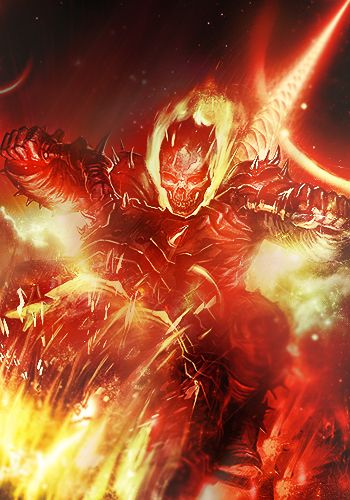
One of the sexiest tags I've ever seen, from Radillac ↓ <3
-

Looks over burned to me, and maybe work on the flow of the wire frame. Doing some smudging behind it, and some spots on soft light

^Great what I think is an abstract giftie from Distello^
Similar Threads
-
By Gaaf in forum Sigs & Manips
Replies: 3
Last Post: 05-06-2011, 01:56 PM
-
By exclusive in forum Sigs & Manips
Replies: 8
Last Post: 02-10-2011, 12:01 PM
-
By ejbonagua in forum Sigs & Manips
Replies: 2
Last Post: 10-25-2010, 07:10 AM
-
By robgasm in forum Digital Art
Replies: 2
Last Post: 03-20-2008, 07:21 AM
-
By Riddleb0x in forum Sigs & Manips
Replies: 3
Last Post: 12-11-2006, 03:24 PM
 Posting Permissions
- You may not post new threads
- You may not post replies
- You may not post attachments
- You may not edit your posts
-
Forum Rules
|
