0 members and 5,999 guests
No Members online

» Site Navigation

» Stats
Members: 35,443
Threads: 103,072
Posts: 826,684
Top Poster: cc.RadillacVIII (7,429)
|
-
-

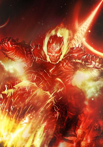
It's good. I like the flow a lot, and I like the blending in the bottom left corner.
Some things to work on : the render, other than the bottom left corner, looks very "on top" of the tag, like it's just pasted in. Especially around his hair. Try doing a little bit of smudging (not with a hard round, but with something like a slightly scattered chalk). Some of the C4D looking stuff feels a little too sharp, especially in the mid/bottom right, and also a little bit "pasted on". The other wire-frame looking renders feel really random, I'd drop those.
And some stuff you should add so it feels more cohesive is : a light source/lighting. This render looks like it could be lit from the top left, you can throw in a big soft brush up there on low opacity, maybe some soft light/linear dodge layers. After that you could darken the bottom right (opposite side of the light). You should also add some adjustment layers. Soft-light gradient maps, color/contrast, that kinda' stuff. It makes the tag feel more together.
Also you could try using some depth of field to fix up the sharpness. Like blurring the bottom right/background pieces with the blur tool, and sharpening the render itself.
-
Its very interesting, my only gripe would be some colour difference between the background and the render is needed to separate them a bit. Other than that nice tag man.

One of the sexiest tags I've ever seen, from Radillac ↓ <3
-
with a little more work on the blending c4d&render/background, this could turn to be a beautiful piece.
From BuBBlez
-
You attempted to leave us? Why? :/ What did we ever do to you? 
Similar Threads
-
By dae67 in forum Sigs & Manips
Replies: 3
Last Post: 08-09-2011, 03:43 AM
-
By NoFeaR in forum Sigs & Manips
Replies: 11
Last Post: 04-24-2009, 01:44 AM
-
By MartinBabies in forum Digital Art
Replies: 8
Last Post: 12-29-2007, 10:25 AM
-
By Kidd in forum Sigs & Manips
Replies: 8
Last Post: 06-08-2006, 11:33 PM
-
By Kite in forum Sigs & Manips
Replies: 8
Last Post: 06-28-2005, 04:24 PM
 Posting Permissions
- You may not post new threads
- You may not post replies
- You may not post attachments
- You may not edit your posts
-
Forum Rules
|


 Reply With Quote