GFXVoid Graphic Design Forum

Remove Text Formatting
Loading...

» Online Users: 8,290

0 members and 8,290 guests
No Members online

» Site Navigation

 > FAQ

» Stats

Members: 35,443
Threads: 103,072
Posts: 826,684
Top Poster: cc.RadillacVIII (7,429)
Welcome to our newest member, Lekelindids
Results 1 to 10 of 10

Thread: Wonder Woman

  1. #1
    Join Date
    Aug 2010
    Location
    Im Problly In The Sky Swimming With The Fishes
    Posts
    155

    Default Wonder Woman

    Haven't done this in a while tried to keep it simple


  2. #2
    Join Date
    Aug 2010
    Location
    Im Problly In The Sky Swimming With The Fishes
    Posts
    155

    Default

    No CnC? Must be perfect! You guys know just what to say to make a guy feel good about his work! *Sarcasm*


  3. #3
    Join Date
    Mar 2011
    Location
    South Africa
    Posts
    400

    Default

    This looks nice! Good job


  4. #4

    Default

    very nice, idont like the text.

  5. #5
    Join Date
    May 2010
    Posts
    1,942

    Default

    Text ruins it and I think she fills too much of the canvas. Everything else looks great.


    My gift wall!
    My gift wall #2!
    My Genesis Tag Tutorial, check it out here!
    My Halo Tag Tutorial, check it out here!


  6. #6
    Join Date
    Aug 2010
    Location
    Im Problly In The Sky Swimming With The Fishes
    Posts
    155

    Default

    Thanks im still working on my text placement and font


  7. #7
    Join Date
    Nov 2008
    Location
    Costa Rica
    Posts
    264

    Default

    I think the only thing, as stated before, is the text, it's like, way bigger than it needs to be and a lot of space between the 2 words there... But great work on the effects, I like them!
    .:|Favorite|:. - - - - - .:Newest:.

  8. #8

    Default

    lol Bogga you're back I see....wtf...you still using my old Void Knights logo :P.....the group is long gone pal :P
    Proud Owner of:
    RichFlyers
    Skype: NovruzeliHuseynov


    ^ LOVE YOU RAD ^


  9. #9
    Join Date
    Jun 2012
    Location
    ATLANTA!
    Posts
    72

    Default

    I like the text but i agree with Derosion I also think she fills too much of the canvas
    i use gimp and paint.net


    A wise man once said: It's not the size of the boat, it's the motion of the ocean. :P

  10. #10
    Join Date
    Jul 2012
    Posts
    9

    Default

    The depth is the best part 
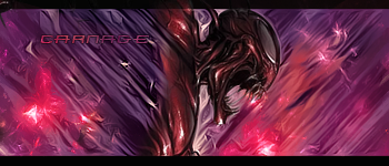
colors blend well together and the flow is strong, but the light source could be strong because of the highlights of her body. The text is too hard as a color and ruins the elegance of the signature.

Similar Threads

  1. Wonder Woman
    By Tryne in forum Sigs & Manips
    Replies: 2
    Last Post: 02-10-2012, 01:29 AM
  2. Cat woman
    By Downfall in forum Sigs & Manips
    Replies: 5
    Last Post: 05-23-2011, 09:47 AM
  3. Wonder Woman
    By ChanceB in forum Sigs & Manips
    Replies: 2
    Last Post: 04-24-2011, 11:32 AM
  4. Wonder Woman
    By Necrothalass in forum Sigs & Manips
    Replies: 3
    Last Post: 01-10-2011, 07:27 PM

Posting Permissions

  • You may not post new threads
  • You may not post replies
  • You may not post attachments
  • You may not edit your posts
  •  
Powered by vBadvanced CMPS v4.1.1