GFXVoid Graphic Design Forum

Remove Text Formatting
Loading...

» Online Users: 1,428

0 members and 1,428 guests
No Members online

» Site Navigation

 > FAQ

» Stats

Members: 35,443
Threads: 103,072
Posts: 826,684
Top Poster: cc.RadillacVIII (7,429)
Welcome to our newest member, Lekelindids
Results 1 to 7 of 7

Thread: 117

  1. #1
    Join Date
    Apr 2012
    Location
    Arizona
    Posts
    21

    Signatures & Tags 117

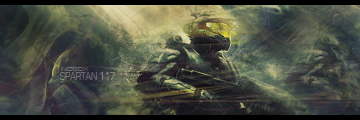
    Yeah, I realize I haven't been productive or active. Life got in teh way. lol

    Anyway, posting this just for possible tips on improving (srsly need to branch out to different styles of smudging).

  2. #2
    Join Date
    Aug 2012
    Posts
    18

    Default

    I like them both bro...

    But neither have any depth to them. But the smudging is decent.

    Overall good job.

  3. #3
    Join Date
    Feb 2011
    Location
    New York City
    Posts
    1,113

    Default

    Quote Originally Posted by Inkz View Post
    I like them both bro...

    But neither have any depth to them. But the smudging is decent.

    Overall good job.
    The bottom is his signature o.o

    As to the sig he posted, the colors look a bit too dull for my taste. It would be cool if the lighting was a bit emphasized+colors enhanced but I like the smudge and blending.

  4. #4
    Join Date
    Apr 2012
    Location
    Arizona
    Posts
    21

    Default

    Yar, I kinda went for a dark contrast to counterbalance the lighting.

    Think a Hue/Saturation might do it. Hmm. As for the depth, suggestions? I just went with what felt good at the time. :3

  5. #5
    Join Date
    Aug 2011
    Posts
    30

    Default

    looks very blurry
    theirs no depth and lose the borders
    it seems flat and the yellow/orange lighting source on the top seems washed out

  6. #6
    Join Date
    Feb 2011
    Location
    New York City
    Posts
    1,113

    Default

    Quote Originally Posted by NosDx View Post
    Yar, I kinda went for a dark contrast to counterbalance the lighting.

    Think a Hue/Saturation might do it. Hmm. As for the depth, suggestions? I just went with what felt good at the time. :3
    For depth, sharpen the render and blur what may be/is far away from the render, thus giving focus to the focal.

  7. #7
    Join Date
    Apr 2012
    Location
    Arizona
    Posts
    21

    Default

    Thanks to all of you who posted your tips.

    I'll change my sig out when i have the time later to let you see the changes. :3

Posting Permissions

  • You may not post new threads
  • You may not post replies
  • You may not post attachments
  • You may not edit your posts
  •  
Powered by vBadvanced CMPS v4.1.1