0 members and 1,635 guests
No Members online

» Site Navigation

» Stats
Members: 35,443
Threads: 103,072
Posts: 826,684
Top Poster: cc.RadillacVIII (7,429)
|
-
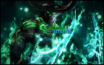
 Illidan the Betrayer Illidan the Betrayer
My newest tag, created today.
C&C would be lovely (be gentle  )! )!
V2
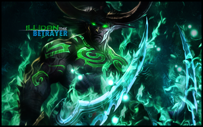
Idea for V3: Keep the text where it is in V1, but lower the brightness of the swords like in V2?
Last edited by Dynamik GFX; 09-13-2012 at 12:50 AM.
-
compared to ur other work in the other thread, this looks like you are progressing, the composition is nice, the colors are popping, and the text is decently placed near the focal. the lighting could use some work, and the border could go perhaps even a crop of about 30-40 pixels off the bottom and this piece would be awesome, great first sig post btw. hope to see more.
-
 Originally Posted by cC.DOMINO™

compared to ur other work in the other thread, this looks like you are progressing, the composition is nice, the colors are popping, and the text is decently placed near the focal. the lighting could use some work, and the border could go perhaps even a crop of about 30-40 pixels off the bottom and this piece would be awesome, great first sig post btw. hope to see more.
Thanks for the review! I just posted a V2; played with the text and the lighting a bit.
Idea for V3: Keep the text where it is in V1, but lower the brightness of the swords like in V2?
Last edited by Dynamik GFX; 09-13-2012 at 12:50 AM.
-
Ya I liked the text where it was, nice lighting adjustment, looks pretty good to me. maybe keep the light balls in the bg but make them pop more than in V1
-
Similar Threads
-
By silent_assasin in forum Sigs & Manips
Replies: 2
Last Post: 12-05-2011, 06:59 PM
-
By Derosion in forum Sigs & Manips
Replies: 15
Last Post: 10-22-2010, 03:14 AM
-
By Signizy in forum Sigs & Manips
Replies: 5
Last Post: 10-14-2010, 06:12 PM
-
By Nevad in forum Sigs & Manips
Replies: 10
Last Post: 10-12-2009, 07:58 PM
-
By theclan10 in forum Sigs & Manips
Replies: 8
Last Post: 02-16-2009, 02:05 PM
 Posting Permissions
- You may not post new threads
- You may not post replies
- You may not post attachments
- You may not edit your posts
-
Forum Rules
|


 Reply With Quote

