0 members and 1,568 guests
No Members online

» Site Navigation

» Stats
Members: 35,443
Threads: 103,072
Posts: 826,684
Top Poster: cc.RadillacVIII (7,429)
|
-
 master-chief halo 4 sig master-chief halo 4 sig
-

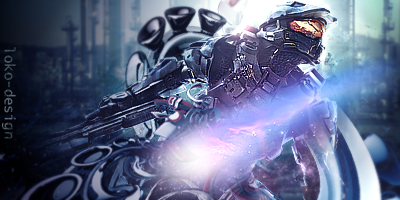
Sorry but as a big halo fan, been playing since halo CE. I'm not digging this at all.
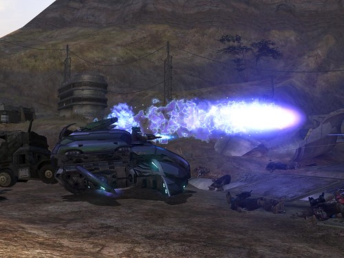
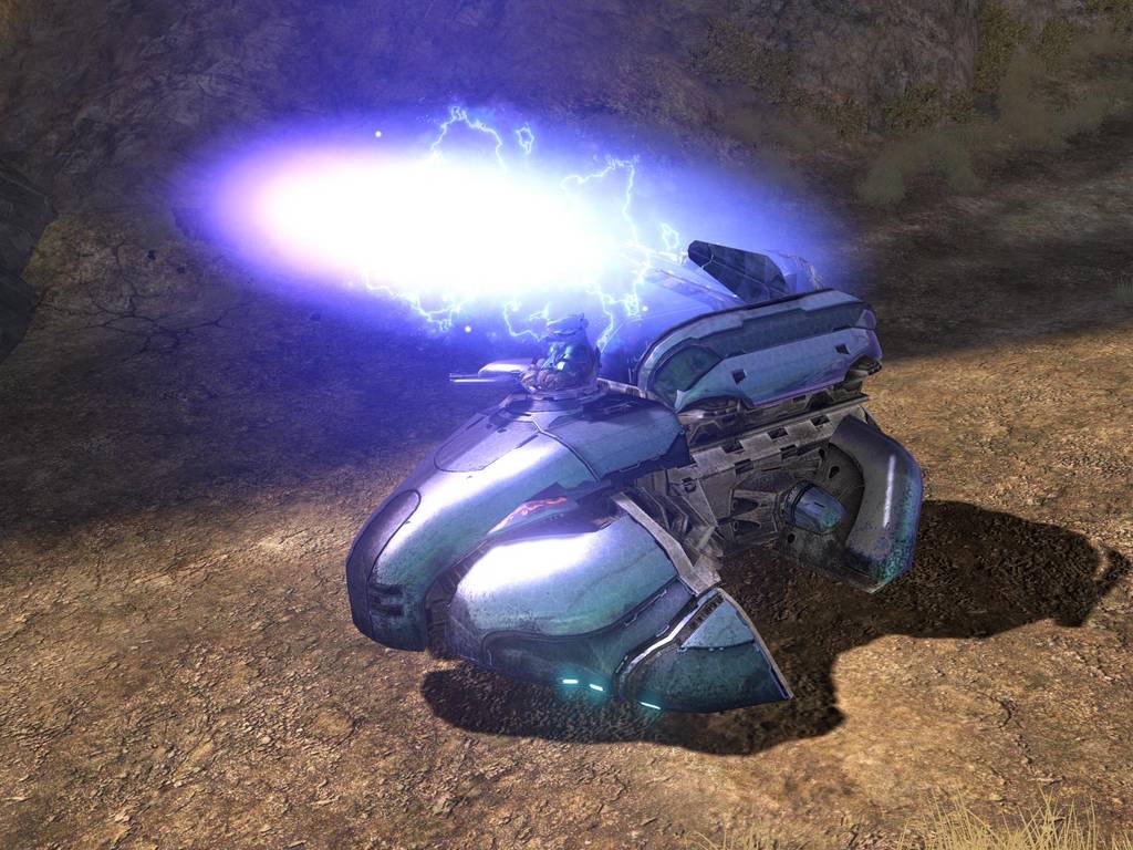
The render have been pulled from the cover for the game and it just doesn't work with the rest of this composition. Wierd background to put with such character and I don't understand the C4D's in the background, they look like those wheels with suctioncups around them that roll down the wall. And what's up with the dead on pink/purple nebula like thing on top of the render? It draws every bit of atention away from the main focal wich should be the character.
The tag lacks flow and just looks messy. Keep at it and you will get it eventually.
-
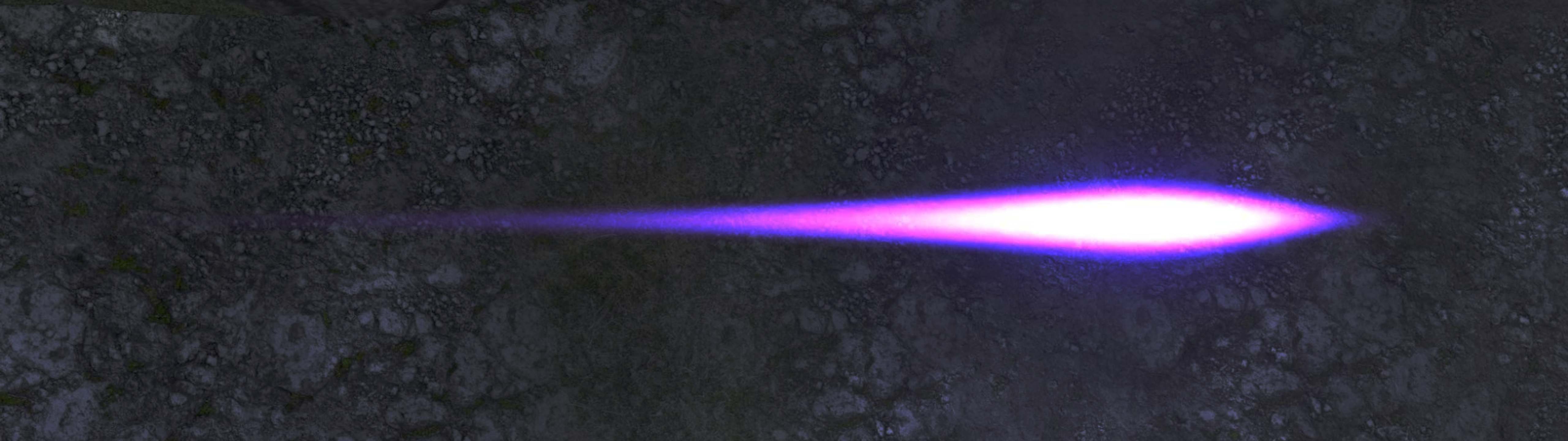
that nebula thing is a plasma round that the chief is dodging
-
 Originally Posted by dj-h4t0

that nebula thing is a plasma round that the chief is dodging
From what vehicle? I don't know if this is suppose to be "realistic"
-
i dont think u need that much imagination to figure out what it is and how am i supposed to fit a vehicle in that
it is just some plasma round shot from some location from some vehicle / covenant
-
Originally Posted by dj-h4t0
i dont think u need that much imagination to figure out what it is and how am i supposed to fit a vehicle in that
it is just some plasma round shot from some location from some vehicle / covenant
Do you play halo? I do and that doesn't look anyway it does in game.
Yes I'm picky, it's what I do.
-
dude i play halo reach at mlg level
all im saying is u dont need that much imagination to seits a plasma bolt
-
here see there pretty similar in my book u just its not exactly the same because i made it from scratch


-
I actually dig this loadzzz, the placement of the glowy thingy is my only complaint, maybe play around with different placements?
Proud owner of the "50 Shades of Syn" series

-
Originally Posted by Wolvy
I actually dig this loadzzz, the placement of the glowy thingy is my only complaint, maybe play around with different placements?
I agree with this entirely my only suggestion or criticisms would be I think it'd look better of you erased more of the right side of the spartan the fading part, also it would add so much if you tweaked the direction the plasmas fumes or "tail" is going an I recommend scrapping the plasma you have done and trying to give it more of an ethereal feeling because the way it looks to me it seems like the grenade is just moving way too fast and it sticks out way too much, otherwise great job really like the flow
 ASPIRING GFX ARTIST, AND CURRENT DIGITAL ART MAJOR.
Similar Threads
-
By BigCookies in forum Sigs & Manips
Replies: 4
Last Post: 12-12-2010, 05:44 PM
-
By Nevad in forum Sigs & Manips
Replies: 2
Last Post: 10-11-2009, 10:07 AM
-
By Stiggeh in forum Sigs & Manips
Replies: 10
Last Post: 04-12-2009, 10:05 AM
-
By evilcheese in forum Sigs & Manips
Replies: 3
Last Post: 08-18-2008, 03:52 PM
-
By Nightfire in forum Sigs & Manips
Replies: 1
Last Post: 09-12-2006, 01:59 PM
 Posting Permissions
- You may not post new threads
- You may not post replies
- You may not post attachments
- You may not edit your posts
-
Forum Rules
|


 Reply With Quote