0 members and 8,375 guests
No Members online

» Site Navigation

» Stats
Members: 35,443
Threads: 103,072
Posts: 826,684
Top Poster: cc.RadillacVIII (7,429)
|
-
 First Attempts First Attempts
Alright so I am new to the forums, and graphics in general. I spent a few hours in the tutorial guides reading through what I hope or were said to be the basics. Here are a few first attempts.
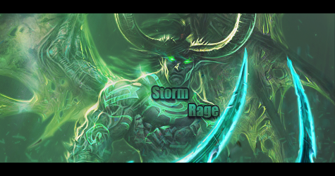
My first :

These I am torn on. I don't know which way to go and I would like to add some text but it just seems out of place or doesn't flow with the sigs. So I need to do some work with text I can already tell lol.
2nd :

3rd :

4th :

5th : I tried working on blending, some blurring techniques and some of the c4d I have seen.

Anyways, those are my first attempts. Any c&c will be helpful. I am gonna be hitting the guides some more, but thought I would share what I've done and maybe get some pointers
-
The reason you are having the text problem is because your signatures don't have focal points within them (the spot where the viewer is supposed to focus). Always remember to have a clear focal point in mind when you begin the signature. You can make sections more noticeable in a few ways (blurring the background, sharpening, smudging, lighting, etc)
My favourite trick is to create a new layer > go to Image and hit Apply Image> Filter Guassian blur at 1.5 > and just erase the parts of the layer that you want to be more focused. Youcan lower the opacity too so the blurring isn't that obvious.
Keep at it man, I look forward to seeing more from you!
-
Yea I have been looking for some lighting tutorials. I did a little blur on the backgrounds (with the blur tool though) to try and create depth but I didn't achieve what I wanted with them. Just having troubles with my lighting effects. Most of the tutorials I have found on lighting actually explains using a a new layer, filling it with white and then lowering the opacity, and erasing the parts I want to stay dark. I might be wrong but, wouldn't I get more out of Filter > Render > Lighting ? Also the tutorials I have read, said to blur the outlines of my renders, then go back with the sharpening tool to make it look not so copy and pasted, my question is.. Is that correct? Cause bluring then sharpening seems to negate each other.
-
See this tutorial and try to make something: http://nobodysk.deviantart.com/#/d5ipo9y I'm a noob as well, but I think you could learn something from this tutorial.
-
Good tutorial, Nobody. Might have to use it later.
Last edited by Darkened_Soul; 10-23-2012 at 05:09 PM.
-
Ty nobody, gonna try out some of these techniques. Will post my newest when I finsih 
-
I made a pretty simple lighting tutorial a while back on how to use brushes and background layers to accentuate parts of the signature. Maybe it might help you a bit :P
link: http://i.tinyuploads.com/q0j2Ot.png
-
Thanks, that does help a bit. I already finished a spidey one with some of the lighting techniques I've read but not satisfied gonna keep experimenting with it before I post lol . Thanks everyone though seriously been a big help thus far and can't wait to show what i've been playin with
-
So this is my newest one. I used only brushes and background layers to create my lighting. I also used the shatter effect posted in the tutorial by 'Breakdown'. I added some blurring in by doing New Layer > Apply Image > Filter > Gausian @ 0.8 then erasing around my focal. Used new layers with black and white brushs to create shadow and light source. Also used the burn tool around certain areas of spidey and edges / corners. Then I added a cooling photo filter at about 18% density and a 2 px border. I know I still got alot of practicing to do but think its a small improvement from my earlier attempts
6th :

Similar Threads
-
By pumpkineater in forum Sigs & Manips
Replies: 5
Last Post: 06-09-2011, 04:56 AM
-
By t3hspud in forum Sigs & Manips
Replies: 8
Last Post: 08-17-2009, 09:44 PM
-
By Killa_GFX in forum Sigs & Manips
Replies: 5
Last Post: 06-16-2009, 11:58 PM
-
By SPeCiaL DeLiVeRY in forum Sigs & Manips
Replies: 2
Last Post: 09-21-2005, 03:51 AM
-
By Xelis in forum Sigs & Manips
Replies: 3
Last Post: 03-11-2005, 04:54 PM
 Posting Permissions
- You may not post new threads
- You may not post replies
- You may not post attachments
- You may not edit your posts
-
Forum Rules
|


 Reply With Quote