GFXVoid Graphic Design Forum

Remove Text Formatting
Loading...

» Online Users: 546

0 members and 546 guests
No Members online

» Site Navigation

 > FAQ

» Stats

Members: 35,443
Threads: 103,072
Posts: 826,684
Top Poster: cc.RadillacVIII (7,429)
Welcome to our newest member, Lekelindids
Results 1 to 4 of 4

Thread: Bugatti

  1. #1
    Join Date
    Jan 2012
    Posts
    37

    Default Bugatti


    CnC

  2. #2
    Join Date
    Dec 2010
    Location
    Toronto, Canada
    Posts
    325

    Default

    Nice. Don't usually like the movie border but it seems to work for this one. GJ


  3. #3
    Join Date
    Feb 2012
    Location
    GFXvoid
    Posts
    401

    Default

    Border looks bad on it, and you need to darken it some more, but other then then it looks great! Good job!

  4. #4
    Join Date
    Aug 2010
    Location
    Canada
    Posts
    3,286

    Default

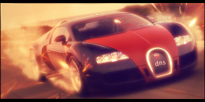
    This piece has a nice blur to it oddly that I like and the focus of the car isn't lost amongst the effects, I like it, the border is kinda flashy but not bad, I would suggest though that you lower the oppacity of your gradients and maybe try playing more with contrast/brightness/colour balance more. That would help keep some colours sharp rather than drownding them out.

    Radi's one of a kind gift <3

    ^My Wish List^


Similar Threads

  1. Bugatti
    By cs4pro in forum Sigs & Manips
    Replies: 13
    Last Post: 03-27-2010, 03:00 PM
  2. Bugatti
    By Takken in forum Sigs & Manips
    Replies: 2
    Last Post: 06-17-2009, 05:58 PM
  3. bugatti veyron 16.4 sig
    By keewee in forum Sigs & Manips
    Replies: 3
    Last Post: 07-10-2005, 02:11 PM

Posting Permissions

  • You may not post new threads
  • You may not post replies
  • You may not post attachments
  • You may not edit your posts
  •  
Powered by vBadvanced CMPS v4.1.1