0 members and 8,104 guests
No Members online

» Site Navigation

» Stats
Members: 35,443
Threads: 103,072
Posts: 826,684
Top Poster: cc.RadillacVIII (7,429)
|
-
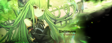
 Green Green

Skeptical on this one, I am.
-
the font doesnt seem to work with this one, also there is a lack of a focal point, the outer edges of the sig shouldn't be so bright specifically the left side, it pulls the viewers eye away from the right side where the render is.
-
I like the font, but the border is bad, but it seems like a good piece, good job!
-
I hope these aren't the only CnC's?
-
I like the colors but otherwise agree with SPC. The font doesn't really fit, not just the style but the color. Might have fit a little better if you sampled the color from the little green splotch on the girl's left arm/shoulder...?(Can't say for sure, I have an issue with text in my tags as well).
I also agree with SPC about the lack of a focal point. Everything in the sig leads the eye to the bottom-left, but nothing keeps the eye from just flying right off. Maybe try a bit of vignette to keep the eye inside the tag? You have those 3 dark spots that almost start to act like a vignette, but for me they actually draw my attention because of the intense contrast with the rest of the tag.
Hope I helped!
-
vignette
1. (Communication Arts / Printing, Lithography & Bookbinding) a small illustration placed at the beginning or end of a book or chapter
2. (Literary & Literary Critical Terms) a short graceful literary essay or sketch
3. (Fine Arts & Visual Arts / Art Terms) a photograph, drawing, etc., with edges that are shaded off
4. (Fine Arts & Visual Arts / Architecture) Architect a carved ornamentation that has a design based upon tendrils, leaves, etc.
5. any small endearing scene, view, picture, etc.
----------------------------------------
I actually googled what you said there. 
So, by vignette you mean I have to put an ornament/illustration/drawing there so it doesn't lead everything to bottom-left?
-
 Originally Posted by Ezzis

vignette
1. (Communication Arts / Printing, Lithography & Bookbinding) a small illustration placed at the beginning or end of a book or chapter
2. (Literary & Literary Critical Terms) a short graceful literary essay or sketch
3. (Fine Arts & Visual Arts / Art Terms) a photograph, drawing, etc., with edges that are shaded off
4. (Fine Arts & Visual Arts / Architecture) Architect a carved ornamentation that has a design based upon tendrils, leaves, etc.
5. any small endearing scene, view, picture, etc.
----------------------------------------
I actually googled what you said there.
So, by vignette you mean I have to put an ornament/illustration/drawing there so it doesn't lead everything to bottom-left?
Nupe, #3 on the list. It just means to softly darken the corners. It kinda forces the eye to turn around instead of shooting off the page (borders sort of do the same thing). Just play with how much to actually bring the darkening in, too much looks bad, not enough serves no purpose.
-
I actually quite like what you did, with a few minor changes of course.
There is a lack of a main focal, but I love the overall flow of the sig. I think the text works, a sort of comic booky feel to it. A few changes that were mentioned above should smarten it right up. Keep em coming.
Similar Threads
-
By exclusive in forum Sigs & Manips
Replies: 1
Last Post: 05-10-2011, 10:05 AM
-
By exclusive in forum Resources
Replies: 4
Last Post: 05-10-2011, 10:04 AM
-
By Waltz in forum Sigs & Manips
Replies: 1
Last Post: 05-07-2011, 03:02 PM
-
By cC.Dispeller in forum Sigs & Manips
Replies: 4
Last Post: 01-08-2010, 09:56 AM
-
By Splendid in forum Sigs & Manips
Replies: 3
Last Post: 03-06-2008, 10:33 AM
 Posting Permissions
- You may not post new threads
- You may not post replies
- You may not post attachments
- You may not edit your posts
-
Forum Rules
|


 Reply With Quote