0 members and 560 guests
No Members online

» Site Navigation

» Stats
Members: 35,443
Threads: 103,072
Posts: 826,684
Top Poster: cc.RadillacVIII (7,429)
|
-
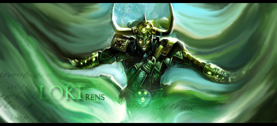
 smudge ? loki smudge ? loki
loki
x.
 Sorry for my bad English
-
That smudge work is nicely done, but the smudgeless blank above his head kinda puts the focus off

^Great what I think is an abstract giftie from Distello^
-
I feel that having text on one side doesn't really flow well.
Also the smudging seems to be a bit too strong, and it kind of makes the image look really beaten up.
also, the smudge makes the image hand the magic of flow, but its not really blur enough to make it fit.
but other than that, that's a wonderful signature!
The sweetest lines from some of
the most romantic poets and thinkers
the world has ever known. Use them the
next time you're at a loss for words.
You make my world shine.♥
-
Agree with Negative about the text, the smudge looks pretty good anyway, maybe the quality of the focal could be better.
Similar Threads
-
By BakaArts in forum Signature Tutorials
Replies: 7
Last Post: 04-15-2012, 06:32 AM
-
By Fork in forum Sigs & Manips
Replies: 6
Last Post: 08-21-2011, 09:02 AM
-
By Fayfie in forum Digital Art
Replies: 3
Last Post: 06-12-2011, 07:45 AM
-
By tekken in forum Sigs & Manips
Replies: 4
Last Post: 12-26-2008, 08:53 AM
-
By Loki X in forum Member Battles Voting
Replies: 17
Last Post: 09-30-2005, 06:22 AM
 Posting Permissions
- You may not post new threads
- You may not post replies
- You may not post attachments
- You may not edit your posts
-
Forum Rules
|


 Reply With Quote

