0 members and 424 guests
No Members online

» Site Navigation

» Stats
Members: 35,443
Threads: 103,072
Posts: 826,684
Top Poster: cc.RadillacVIII (7,429)
|
-
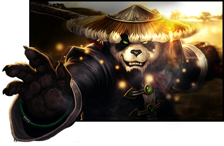
 Pandamonium Pandamonium
So, I haven't touched Photoshop in quite some time, as I've been going through some personal issues. With that being said, please keep that in mind when you make your critiques on this tag, as it might be of lesser quality than what I've previously posted.
Thanks!
-
Hey that's one of my usernames  anywho i love the pop-out effect, really adds something to the piece.if i were to say what i dont like only there's four things. anywho i love the pop-out effect, really adds something to the piece.if i were to say what i dont like only there's four things.
1: the green eyes: the green doesn't match the warm tones used in the rest of the piece specifically on the buttons and eyes. the dark green bracelet isn't bad, but the other greens are a bit too barf colored for me. i would have chosen a bright red as a contrast color that stayed within the color scheme
2 the dots in front: they're just distracting and there's not enough of them to really add anything to the piece. now if they wrapped around his hand and made it seem like magic or something then that would completely change my feelings on this, i just think they're too sparse to really be effective in the piece. also i think you put the shading layer on top of the dots which is giving the ones on the left a weird color
3 the smoke near his face: it's right on top of the focal point and it detracts from the intensity of the focus. i would move it to the edges of the square to give the piece the same smokey quality but without detracting from the subject
4 the lighting in the background: a source of light doesn't just cut off. the left side and right side have to display the light as if it were a true light source and if any light were to cross his hat it would also cross the sky. i think the shadows need to be a little more dependent on the light source. On the panda, from what i can tell, there's two light sources, although really it's not perfect. there's a random light source on his face and the rest is lit by something coming from behind him. So the origin point of your light source isn't incorrect at all, the shadows are just weird maybe. also be careful about his hat. on the left side there's a part that's clearly lighter than the rest which is because of the light source behind him but you added a shadow on top of it. if you want to keep the shadow then you can make a layer specific to that one area of his hat and make it the same color as the rest of the left side of the hat, or you could change the light source.
now that i've completely torn away all your confidence, i want you to know that the fact that i can specifically identify four things that i dont like is actually a compliment. on pieces that aren't comprehensively put together and well thought out and organized it's much more difficult to critique because you can't say "oh your light source isn't quite right" when they don't have a subject, or when there isn't even a light source at all. the overall composition is great and the only reason i critique this is because i look at this like a piece of art rather than a signature. so good job, and don't forget to put your name on it. I'm sure i'm not the only one who's come across someone claiming my work as their own before. it's a sad, hurtful experience.
good job man,
-
Thanks for all of the honest critique!
Regarding the green colors in the piece; I didn't touch them at all. They were already green, and I didn't feel the need to change them, as I think they break up the monotony of the colors in just the right way. As far as the bubbles are concerned, I didn't want them to be too overdone and dominate the piece, and I tried having them wrap around his hand, but seeing as his hand is popping out of the borders of the piece, they didn't look right when popping out as well...
The smoke near his face is a good point; I agree with that one completely. With regards to the lighting in the piece, I admit, it's flawed, but, in my defense, this was a tricky one. The background that I used has the light source in it already, and I actually didn't enhance it at all (I actually made it a bit darker). With all of the places that there are light coming in on the render, it's hard to effectively place a light source, so I did what I could with the skills that I currently have. The shadowing may seem off, but that's merely my method of helping to draw the eye to the focal of the piece, by shading the edges of the design in a moderate manner so that the details are less noticeable, and your eye is drawn to the focal (or focals in this case, as there's the render face and then the hand).
All in all, it may not be perfect, but I still think it's pretty damn good after having been out of Photoshop since September.
 Posting Permissions
- You may not post new threads
- You may not post replies
- You may not post attachments
- You may not edit your posts
-
Forum Rules
|


 Reply With Quote


