GFXVoid Graphic Design Forum

Remove Text Formatting
Loading...

» Online Users: 360

0 members and 360 guests
No Members online

» Site Navigation

 > FAQ

» Stats

Members: 35,443
Threads: 103,072
Posts: 826,684
Top Poster: cc.RadillacVIII (7,429)
Welcome to our newest member, Lekelindids
Results 1 to 2 of 2

Thread: double focal

  1. #1
    Join Date
    Dec 2012
    Posts
    143

    Default double focal

    That was the theme on another board

  2. #2
    Join Date
    May 2013
    Location
    Canada
    Posts
    7

    Default

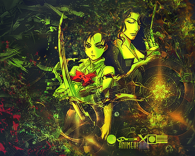
    I know that some people might see me as a little harsh but I say what I need to say. First of all, the signature is very dull. Dull, in a sense that the coors are too relaxing that it doesn't grab attention too long. Red and Green match but the Orange threw me off. I gues you tried blending both BG and Render? The blend is too noticable. Try using GM (Gradient Map) on the BG to blend it to the render, instead of blending them together at the same time. Finally, the text seems to be placed on the wrong spot. Move it a bit higher.

    I might be wrong but I would say you should try revising this. It's a well done Sig, you can bet on that, but improvements should be made to make it an even better one!

    Cheers!

    P.S. I hope you dont hit me for critiquing your work


    Perception is Reality. The only truth in this existence is existence itself. - S.N. Lam

Similar Threads

  1. swivly n focal
    By DREAM ReaLitY in forum Sigs & Manips
    Replies: 0
    Last Post: 11-18-2012, 01:16 AM
  2. Eyes - Double Focal SS Entry
    By Gallagher in forum Sigs & Manips
    Replies: 1
    Last Post: 09-07-2011, 05:32 AM
  3. The Focal Effect>>
    By Takken in forum Sigs & Manips
    Replies: 5
    Last Post: 07-14-2009, 06:27 AM

Posting Permissions

  • You may not post new threads
  • You may not post replies
  • You may not post attachments
  • You may not edit your posts
  •  
Powered by vBadvanced CMPS v4.1.1