GFXVoid Graphic Design Forum

Remove Text Formatting
Loading...

» Online Users: 764

0 members and 764 guests
No Members online

» Site Navigation

 > FAQ

» Stats

Members: 35,443
Threads: 103,072
Posts: 826,684
Top Poster: cc.RadillacVIII (7,429)
Welcome to our newest member, Lekelindids
Results 1 to 3 of 3

Thread: Stock tag

  1. #1
    Join Date
    Dec 2012
    Posts
    143

    Default Stock tag


  2. #2

    Default

    Eh, I'm not really a big fan of the colors in this one. Also, it looks too light and the reddish (blur?) makes the piece look flat.

  3. #3

    Default

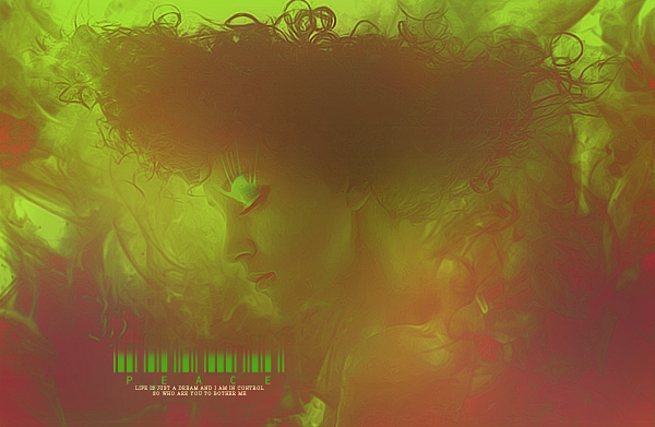
    Love the colors and loooove the effects on the render. Nice touch. The text is magnificent, however I do not enjoy flat images with zero depth. It makes my eyes wander off the image very easily. Depth draws the eyes into the piece rather than everything being seen at one quick glance and yet not seing anything.

Similar Threads

  1. First sig with stock
    By Necrothalass in forum Sigs & Manips
    Replies: 2
    Last Post: 08-08-2010, 04:44 AM
  2. AnyOne Have DBZ Stock
    By DarkaiX in forum Resources
    Replies: 0
    Last Post: 07-30-2010, 03:58 PM
  3. Replies: 15
    Last Post: 03-30-2010, 08:57 PM
  4. Stock
    By Lew in forum Sigs & Manips
    Replies: 3
    Last Post: 06-26-2008, 08:50 AM
  5. Second stock try...
    By Immortal. in forum Sigs & Manips
    Replies: 9
    Last Post: 06-02-2008, 10:15 AM

Posting Permissions

  • You may not post new threads
  • You may not post replies
  • You may not post attachments
  • You may not edit your posts
  •  
Powered by vBadvanced CMPS v4.1.1