0 members and 519 guests
No Members online

» Site Navigation

» Stats
Members: 35,443
Threads: 103,072
Posts: 826,684
Top Poster: cc.RadillacVIII (7,429)
|
-

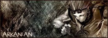
This sig is for a battle, give me alot of criticism...even if it is harsh. 
-
GJ no complaints here and trust me i'm harsh  keep up the good work keep up the good work
-
looks plain  render bg and some text.....i dont really like the background though IMO. render bg and some text.....i dont really like the background though IMO.
DONT talk if you have NOTHING good to say.
-
Well...could you be more specific. Like tell me what I could do to make it not plain?
-
I think more brushing of the background would look better to add more feel. Other than that, it looks really nice.
-
i think it looks like its been hand drawn i really like it good job
-
i think it looks like its been hand drawn i really like it good job
argghh posted twice delete delete where is it lmao
-
Originally posted by nightfire_uk@Jul 4 2005, 10:26 AM
i think it looks like its been hand drawn i really like it good job
argghh posted twice delete delete where is it lmao
[snapback]73336[/snapback]
lol yer i hate it when forums do that, you like the page is non responding and then you click 'post' again and it goes thru and you're like  but you find out you've double posted!!!!!11one oww noes. but you find out you've double posted!!!!!11one oww noes.
-
does seem a bit plain, theres too much free space right above where ur name is, like ice said all it looks like is a bg, some brushing, a render, and text. Bc i know that render was originally red i woulda used red as a theme color for him, but i like how u did the colors actually. I'd brush some more towards the left and try to do more with your text.
-
Ok, thanks for the comments guys.
 Posting Permissions
- You may not post new threads
- You may not post replies
- You may not post attachments
- You may not edit your posts
-
Forum Rules
|


 Reply With Quote