0 members and 995 guests
No Members online

» Site Navigation

» Stats
Members: 35,443
Threads: 103,072
Posts: 826,684
Top Poster: cc.RadillacVIII (7,429)
|
-
-

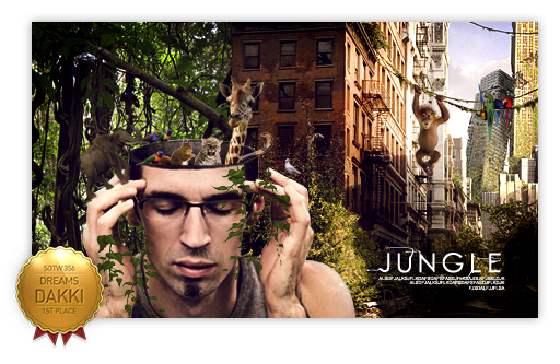
nice work.. but i think it would be more good looking if u add some lyts near the focal...
-
Maybe leave some more space withoud C4D, it could make some more depth and you can make some better lightning.
-
Need a little colour variation in there, I'd try using a different colour of C4D in some areas to help with that. The blur on the right is a little strong imo so I'd consider reducing that. But overall its a decent looking sig, deffo try out a few more 
-
More lighting , focusing on the focal
more attention at the focal - less attention to the outside of the picture
and more blending the focal to the c4ds/background !
blend it all together more with smudging and such, blurring and sharpening, lighting and darkening - bring out a focal!
Right now the c4d at the bottom right is kinda getting a lot more of my attention than it should be! Draw me in to the center!
colors go well , take advantage of his orange heart light / eye lights to add orange (blurred c4d fractals, linear dodge add) lighting effects
all mere suggestions! good work
-
Need more lighting man, and you need to work on blending! 
  I be that sexy ass nigga,
from that hood full of killers!
I be that sexy ass nigga,
from that hood full of killers!
Similar Threads
-
By `Knight in forum Sigs & Manips
Replies: 3
Last Post: 08-30-2011, 02:13 PM
-
By Timentia in forum Digital Art
Replies: 3
Last Post: 05-07-2011, 06:35 PM
-
By BakaArts in forum Resources
Replies: 7
Last Post: 03-29-2011, 08:09 AM
-
By the1jah in forum Sigs & Manips
Replies: 6
Last Post: 08-15-2010, 08:57 PM
 Posting Permissions
- You may not post new threads
- You may not post replies
- You may not post attachments
- You may not edit your posts
-
Forum Rules
|


 Reply With Quote