0 members and 1,916 guests
No Members online

» Site Navigation

» Stats
Members: 35,443
Threads: 103,072
Posts: 826,684
Top Poster: cc.RadillacVIII (7,429)
|
-
-

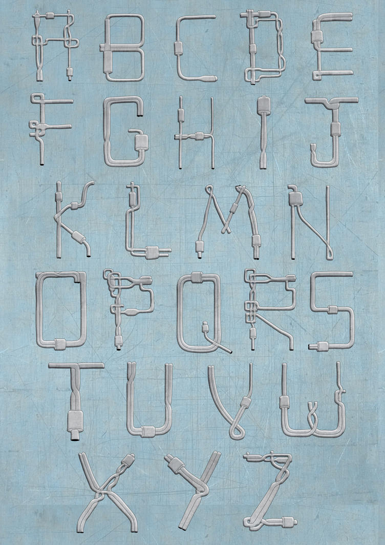
Many of them has too harsh shading, the C, M, S and V are best imo, use the same shading on the rest.
For BG, go subtle and clean, light gray with a hint of turquoise, the pipes is your focus.
Make the order more even and symmetric tho.
I must say you did a outstanding job. Hit the final version up on dA and I'll fav it for sure.
ps... You forgot Å Ä Ö, hehe.
-
 Originally Posted by cC.RadillacVIII

Many of them has too harsh shading, the C, M, S and V are best imo, use the same shading on the rest.
For BG, go subtle and clean, light gray with a hint of turquoise, the pipes is your focus.
Make the order more even and symmetric tho.
I must say you did a outstanding job. Hit the final version up on dA and I'll fav it for sure.
ps... You forgot Å Ä Ö, hehe.
Haha.
Pleased to say it's all done and printed off!
Cheers for the advice, took me a few days to reply because I've been working on finishing other parts of the project.
I switched up the shading to stuff much lighter and added a grey/turquoise background and used the metal texture as an overlay.
Here's the dA if you want to see it full size: http://achroitegraphics.deviantart.c...=1&ga_recent=1
Thanks guys, couldn't have done as well without you.
"The key to success is to be able to sacrifice what you are for what you will become"
-
Sexy man and congratualtions!
+fav and +watch at dA 
Similar Threads
-
By λdam in forum Digital Art
Replies: 9
Last Post: 02-03-2009, 10:40 AM
-
By Bradley in forum The Void
Replies: 35
Last Post: 11-15-2006, 04:25 PM
-
By Tyson in forum Digital Art
Replies: 7
Last Post: 03-16-2006, 01:10 PM
-
By Deadloader in forum The Void
Replies: 27
Last Post: 11-10-2005, 11:36 AM
-
By tacoX in forum The Void
Replies: 16
Last Post: 08-13-2005, 08:32 PM
 Posting Permissions
- You may not post new threads
- You may not post replies
- You may not post attachments
- You may not edit your posts
-
Forum Rules
|


 Reply With Quote

