0 members and 376 guests
No Members online

» Site Navigation

» Stats
Members: 35,443
Threads: 103,072
Posts: 826,684
Top Poster: cc.RadillacVIII (7,429)
|
-

This is my second sig using photoshop... my first was the one of shippo i entered in the newb battle, but i think this one is a considerable improvement, what do you guys think of it 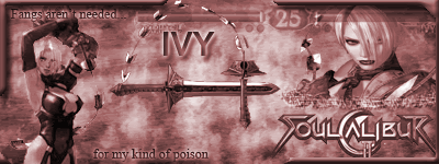
-
btw its the one i entered in the SOTW contest
-
Ah i hate ivy =P
Lol, she always was the person hard to beat for me. Anywho, i like the idea. The animation is distracting and pointless take it off. Try taking a out a few of the renders. Keep it to 2 renders. The border is kinda ugly, just make a simple 1px border. Bg is also kinda boring and could go for a bit of brushing.
Sorry if i was a bit harsh, but thats how we learn =D If you need any help you can always send me a pm or im on aim at bigfatguy6969.
Good work, so far keep it up!
-
alright, thanks for the suggestions, but im not gonna change it again, as far as i know we only get on edit for SOTW, but oh well, i like it the way it is. ;p
 Posting Permissions
- You may not post new threads
- You may not post replies
- You may not post attachments
- You may not edit your posts
-
Forum Rules
|


 Reply With Quote