0 members and 5,126 guests
No Members online

» Site Navigation

» Stats
Members: 35,443
Threads: 103,072
Posts: 826,684
Top Poster: cc.RadillacVIII (7,429)
|
-

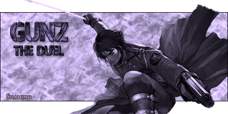
ALright, flaws i'll post that i know:
Leg doesn't look nice cut off, sorry.
Sword looks a little pixelated and shouldn't be there, funny story behind that...
The cape near the end? That's it being cut off in the picture, it's not pixely, that's the way the cape should be. This is my VERY FIRST pop out submission to GFX void, the first i made was a few hours ago involving a render too big and well.. It was crap.
I'm expecting to be ripped to shreads, but when you do- tell me what to do to make it better, don't just list all my faults.
-
great consept and render send me it in a pm please im not diggin the bg tho but nice font and render great job, much better then last one
Creator of the GFXvoid Header......................................Retired GFXvoid Staff.
Currently: Never Here
-
I don't really like how the render gets cut off at the top and bottom. The background's a little plain, but still pretty good. Otherwise it's pretty good, keep up the good work man...
-
I like it. The bg could use more brushing, and the render gets cut off at the bottom. I like tho, good work, keep it up.
-
Do you play GunZ?
That is the exactly like what I wanted to do with one of the renders from it. Im not too big of a fan of that BG tho, plus you double brushed in the bottom left XO
I think if the render was moved up instead of popping out the bottom it would look better.
Overall Good Work XD
-
Yeah i play guns, i'm a lvl 17 and that reminds me, i need to go lvl up 
But yeah, when i saw the images and stuff I knew, despite the fact they're huge, I NEEDED to make a sig. They were too small for conventional sigs, so i thought it'd be good to pop 'em out. You got a keen eye with brushings. Thanks a lot guys.
-
Much better than you're first one, and, well, I love it. The render's nice, but it being cut out still irks me. *shrugs* I like it with the brushing, it adds some aspect you know? Good job man.
(ON Another Note. I know I haven't posted much, and you [as in general public] can tell by Shamino's post count, and mine (I joined before he did). I apologize. I haven't had time to look around this board, so I'm going to try and retire from other boards that require my presence. Heh)
~Manuel
-
Good sig :P keep doing good work
...Forget everything you know about life, work, death, dreams, hate, sex, love... and just open your eyes
-
its ok...not feeling the BG though color is koo should try a lil multi color O_O
-
The purple looks good ant go with the sig theme
...Forget everything you know about life, work, death, dreams, hate, sex, love... and just open your eyes
 Posting Permissions
- You may not post new threads
- You may not post replies
- You may not post attachments
- You may not edit your posts
-
Forum Rules
|


 Reply With Quote