0 members and 2,799 guests
No Members online

» Site Navigation

» Stats
Members: 35,442
Threads: 103,075
Posts: 826,688
Top Poster: cc.RadillacVIII (7,429)
|
-

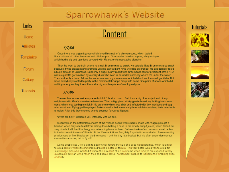
This is my second template i've ever made and THIS is my first attempt at a website template that I made about a year ago  It was never finished so yeah It was never finished so yeah 
This is the first true template i've made and it's the first verion so I wish to make it better with your comments! Please reply about this one and maybe the other one too

I spent the night on it and I messed up at one point where I had done everything in green and I put a background on and it turned it this colour. Looks way better now :P
I know that there is a jagedy line above the content box and will fix that tommorrow.
-
It's not to shabby. It needs a better font at the top. Also the title is horrible.
I dont think the Tutorial images are working to well. I dunno, i think you should get rid of that part, or re-design it. Good work, can't wait to see more!
-
Ok, I was thinking that it wouldn't work, I'll proberaly will just cut that side off.
EDIT:Here's 2 revisions...


Remember I am going for simple and not complex.
EDIT2:Another version...
-
Looks happy and colorful lol. I like the colors, but I don't like the gradients too much.
Try putting the gradients closer together (meaning more similar colors). I don't think I like the edited ones very much.
Like BFG mentioned, just fix the text on the first one you had.
I also like the first template you made. It's very good for a first.
Keep working on this one.
-
Ok, I'll change the gradient on the middle one. Are the side ones ok?
-
Yeah the sides seem to be fine.
-
keep the sides
its perfectly fine
i like it
..The Dream.
SOTW #73 Winner
-
Someone offered to buy it 
-
Cool, do they want you to code it as well :O
First version is best and could be coded if you know what your doing.
-
The colours make it look flat and boring, add a background with some depth, and keep it completely flat, or add alot of depth. Try and keep it more simplistic aswell, dark and light.. this has too much in it for me.
Similar Threads
-
By jerner in forum Digital Art
Replies: 3
Last Post: 02-20-2006, 10:35 PM
-
By Marc in forum Other Tutorials
Replies: 10
Last Post: 08-09-2005, 03:42 AM
-
By Krimsyn in forum Digital Art
Replies: 15
Last Post: 07-28-2005, 05:52 PM
-
By rapidx in forum Sigs & Manips
Replies: 7
Last Post: 04-13-2005, 11:24 PM
 Posting Permissions
- You may not post new threads
- You may not post replies
- You may not post attachments
- You may not edit your posts
-
Forum Rules
|


 Reply With Quote


