0 members and 679 guests
No Members online

» Site Navigation

» Stats
Members: 35,442
Threads: 103,075
Posts: 826,688
Top Poster: cc.RadillacVIII (7,429)
|
-
 Knight sig CnC please? Knight sig CnC please?
Well im currently working on losing monotoning and l just made this and wanted to know what you guys think.I didnt use any brushes for these sigs.
1.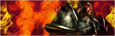
2.http://img.photobucket.com/albums/v6...54/wolfgfx.png
Thanks guys 
-
i like them though the maybe blend that render and change the colour of the text but great job
-
which do you like better small one or bigger one and what colour do you suggest the text be?
-
i like the bigger version better but with the text you could use the colour picker tool or just make it a bit bigger
-
The render could have been made to fit the backround, or u could have changed the backround color to be more like the render. its alos pretty bland on the left side. id add somthing there. ive been having the same problem, i am also pretty new to photoshop, and anyways id add ligth strokes over there to make it less bland. or somtin like that.
 My DevART
RATCHET is my bitch
Andrew says:
u ever stolen a bible?
Apathy says:
no
used the last two pages to roll a joint though
Andrew says:
wow
thats fucking hard core
^^HAHAHA, dm sucks XD
-
k thanks Andrew ill take in these suggestions =)
-
maybe change background color to get close to color of the render. then do a copy of render and blur it whatever way looks good. I'm new too 
-
k thanks Voodoo ill keep experimenting
Similar Threads
-
By Mr. Kenny in forum Digital Art
Replies: 22
Last Post: 01-26-2006, 04:02 PM
-
By ghetto fab in forum Sigs & Manips
Replies: 11
Last Post: 02-26-2005, 09:04 AM
 Posting Permissions
- You may not post new threads
- You may not post replies
- You may not post attachments
- You may not edit your posts
-
Forum Rules
|


 Reply With Quote


