0 members and 725 guests
No Members online

» Site Navigation

» Stats
Members: 35,442
Threads: 103,075
Posts: 826,688
Top Poster: cc.RadillacVIII (7,429)
|
-
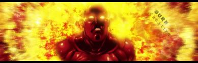
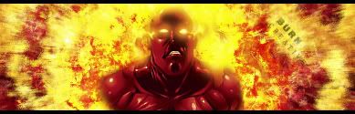
 Burn! Burn!
V1
V2
Last edited by Creative; 11-06-2007 at 04:37 PM.
NEWEST
 MY FIRST
-
-
Hmm,I think there are some really good things about this sig, and a couple not so helpful things.
The Bg is pretty good, though it could use some depth it isn't bad, but them middle of it is pretty blurring which draws your eyes away from the render. So you might wanna try and sharpen that.
The blending where the render goes from red to fire, is okay, it seems a little bit awkward feeling though. Maybe if you add a clipping mask right there on that spot or something it'd flow through the transition a bit nicer?
And the text, the Creative part isn't bad but the BURN in bold is really killing it for me. Maybe unbold it and move it somewhere else or something.
But the Bg is pretty good and the blending is pretty good too, I'd go with version 2.
 My DevART
RATCHET is my bitch
Andrew says:
u ever stolen a bible?
Apathy says:
no
used the last two pages to roll a joint though
Andrew says:
wow
thats fucking hard core
^^HAHAHA, dm sucks XD
-
Try to blend the render in a bit better at the shoulders... aside from that, it's pretty bright.
Similar Threads
-
By unit_number_43 in forum Support
Replies: 25
Last Post: 06-18-2006, 07:08 AM
-
By zade one in forum Sigs & Manips
Replies: 7
Last Post: 11-24-2005, 05:15 PM
-
By tacoX in forum The Void
Replies: 19
Last Post: 06-18-2005, 07:32 PM
 Posting Permissions
- You may not post new threads
- You may not post replies
- You may not post attachments
- You may not edit your posts
-
Forum Rules
|


")


 Reply With Quote


