0 members and 14,200 guests
No Members online

» Site Navigation

» Stats

Members: 35,442
Threads: 103,075
Posts: 826,688
Top Poster: cc.RadillacVIII (7,429)
|
-
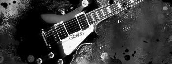
 Gibson Less Paul Gibson Less Paul
hope someone likes it, n tell me what to do XD wasnt very creative -_-
C&C plze ._.
Gibson Less Paul v1

Gibson Less Paul v2
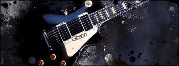
Gibson Less Paul v3
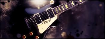
Gibson Less Paul B&W

Last edited by DeadlyShadow; 04-22-2008 at 09:24 PM.
-

v2 i like the colors 
-

I love Gibson Les Paul's, and I love v1 because it gives it the authentic ivory look. Border looks a little small though, but great job. 

Commissions and stickers available via linktree here.
-

V1, although I'd remove the smudge from the lower right hand corner of the guitar, since you already have the back blended in.
Also try some contrast and add some lighting.
Nice job though 
-

v1,but i dont like the clipping mask in middle :/
Favourite

-

V1 FTW!..maybe a mix between 1 and 2 would look better. like 75% and 25%
However you definetly should add a light source. Right now its a bit to dark it could sue a bit more. Nice job with the blending and bg, the sharpened effects around the side look nice.
However i kind of question whether the rough Bg goes well with the smooth body of gibson. Maybe a bit of a more smooth feeling background would have been more appropriate.
 My DevART
RATCHET is my bitch
Andrew says:
u ever stolen a bible?
Apathy says:
no
used the last two pages to roll a joint though
Andrew says:
wow
thats fucking hard core
^^HAHAHA, dm sucks XD
-

thnx for the comment everyone ^^
btw papa i tryed what i said, or atleast i tryed to do it XD
-

they are all actually to hard for me to choose, but if i had to, v1. gj XD
-

I Like It Very much Everything Is Very Clear Colours Are Good ( In The Coloured Ones ) But The One That Sticks Out To Me Because Of The Light Source And Has More Depth
9/10 
Similar Threads
-
By -C-R-O-N-I-K- in forum Sigs & Manips
Replies: 0
Last Post: 12-22-2007, 09:02 PM
-
By Pet in forum Digital Art
Replies: 3
Last Post: 12-02-2007, 03:35 AM
-
By JackMehoff in forum Sigs & Manips
Replies: 3
Last Post: 08-04-2007, 09:12 PM
-
By unit_number_43 in forum The Void
Replies: 5
Last Post: 06-18-2007, 08:30 AM
-
By DinoKind in forum Sigs & Manips
Replies: 2
Last Post: 06-16-2005, 08:49 PM
 Posting Permissions
- You may not post new threads
- You may not post replies
- You may not post attachments
- You may not edit your posts
-
Forum Rules
|
