GFXVoid Graphic Design Forum

Remove Text Formatting
Loading...

» Online Users: 26,370

0 members and 26,370 guests
No Members online

» Site Navigation

 > FAQ

» Stats

Members: 35,442
Threads: 103,075
Posts: 826,688
Top Poster: cc.RadillacVIII (7,429)
Welcome to our newest member, Lekelindids
Results 1 to 8 of 8

Thread: Moth

  1. #1
    Join Date
    Apr 2005
    Location
    Springfield, MO
    Posts
    1,736

    Default

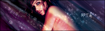
    Well I made a sig called moth about 4 or 5 months ago and I've always had a soft spot for it but it was missing..um..flare so I figured I would rework it.


    This was the original. <3


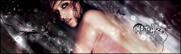
    and though I was kind of wanting to just kind of add effects to spice it a bit I kind of went crazy as you can see and its alot different now. I think I might hate it, but I figured I would get some others opinions..so um C&C on which is better and maybe if you see anything I need to change on the second one. The more I look at it the more I hate it...

  2. #2
    Join Date
    Aug 2005
    Location
    Ye Olde England
    Posts
    43

    Default

    looks pretty good to me. got nothing negative to say about it..

  3. #3
    Join Date
    Jul 2005
    Location
    Virginia
    Posts
    1,667

    Default

    Cant say which one i like most but cool anyways, good job.

  4. #4
    Join Date
    Jun 2005
    Posts
    158

    Default

    ^^^ agreed

  5. #5
    Join Date
    Jun 2005
    Location
    NSW, Australia
    Posts
    3,262

    Default

    Both are awesome in their own way so can&#39;t choose

    Great job

  6. #6
    Join Date
    Apr 2005
    Location
    long a
    Posts
    1,642

    Default

    Wow guys please stop spamming. 2 posts in a row were spam. Come on its really obvious. Give some real CnC!

    Ok. I really like the first version for the colors. I love the second one for the detail but I have to say I like the 2nd one better because of the good text and the awesome flow of the sig.. overall good revisions!

  7. #7
    Join Date
    Apr 2005
    Posts
    1,287

    Default

    1st&#39;s colors are awesome, and 2nd&#39;s detail is good...

    hmm

    Gonna chose ver 2 as the better one, I say current too

  8. #8
    Join Date
    May 2005
    Location
    Pha-Q
    Posts
    1,164

    Default

    I like the first one the best. has color, the 2nd one lacks enough color.
    I dont like the text on both. you need to work that some more.
    it doesnt look like its apart of the sig. blend it some more.

    If you like the 2nd one best.. add some color..


    *AGREE, ALOT OF SPAM AS I WAS READING THIS I WAS GOING TO POST SOMETHING THEN SOMEONE ALLREADY DID* thank you..


Posting Permissions

  • You may not post new threads
  • You may not post replies
  • You may not post attachments
  • You may not edit your posts
  •  
Powered by vBadvanced CMPS v4.1.1