GFXVoid Graphic Design Forum

Remove Text Formatting
Loading...

» Online Users: 2,066

0 members and 2,066 guests
No Members online

» Site Navigation

 > FAQ

» Stats

Members: 35,442
Threads: 103,075
Posts: 826,688
Top Poster: cc.RadillacVIII (7,429)
Welcome to our newest member, Lekelindids
Results 1 to 9 of 9
  1. #1
    Join Date
    May 2005
    Location
    Texas.
    Posts
    1,584

    Default

    Hey guys, I just made this sig off of this wallpaper. HERE

    V1:


    V2:

    ^Added the alien in it :P


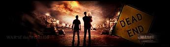
    I got the urge to check out the War of the Worlds website (because I was about to watch the movie), and I was checking out all the downloads, wallpapers, and looking at the movie trailers, when I found this wallpaper (japan 2 no logo). I looked at it a bit, and I saw the people standing and everything and I thought "that would look awesome in a sig." So that's where I got the inspiration.


    CnC?
    Which one should I current?
    Current Tag:


    Are you a deviant?
    I am
    www.firetap.deviantart.com


  2. #2
    Join Date
    Apr 2005
    Posts
    764

    Default

    WAR OF THE FACE

    RAGHHHHH

  3. #3
    Join Date
    Apr 2005
    Posts
    1,891

    Default

    NM, i cant see it..

    Its alright.. what did you do to it?.... ive see nthis one before :P....

    looks like all you did was pimp up the lighiting....


  4. #4
    Join Date
    Jul 2005
    Location
    Virginia
    Posts
    1,667

    Default

    Looks cool to me, both versions are good.

  5. #5
    Join Date
    Apr 2005
    Location
    Singer Island, FL
    Posts
    5,206

    Default

    v1 is hot god i love it nj

  6. #6
    Join Date
    Jun 2005
    Location
    NSW, Australia
    Posts
    3,262

    Default

    v2 looks better since you did more to the wallpaper than in v1 Looks seksiful to me <3

  7. #7
    Join Date
    Sep 2005
    Posts
    45

    Default

    To be honest,It dosnt really look like you really did anything at all but shrink it and add some text. I perssonally like the one with the little alien, its makes it like the people in the picutre are looking at their inpendining doom.

  8. #8
    Join Date
    Jun 2005
    Location
    U.K.
    Posts
    3,462

    Default

    Looks like metal&#39;s sig.. again..

    The sig itself looks good tho.

  9. #9
    Join Date
    May 2005
    Posts
    52

    Default

    yep lumix i thought the same thing...

    its alright but alot like metals..


    Hardy^

Posting Permissions

  • You may not post new threads
  • You may not post replies
  • You may not post attachments
  • You may not edit your posts
  •  
Powered by vBadvanced CMPS v4.1.1