0 members and 653 guests
No Members online

» Site Navigation

» Stats
Members: 35,442
Threads: 103,075
Posts: 826,688
Top Poster: cc.RadillacVIII (7,429)
|
-

^ Latest ^
^ One Right Before That One ^
IS IT ANY BETTER ??
-
ew ew ew ew ew on the first one dude, SHARPEN THE RENDERRRRRRRRRRRRRRRRRRRRRRRRRR
-
stock is waaaaaaaaaay LQ on the first one and those bgs are pretty boring
-
^ Like they said, the render on the first signature is really bad. Crappy quality, so I suggest next time, don't use any low quality renders. BG needs more depth, very flat at the moment imo.
I think you already posted the second signature before. But anyway, the BG needs more depth again. Blend the car in and I don't really like the size of the signature. Text needs improvement as well. Keep trying 
-
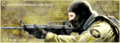
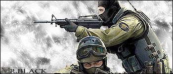
Counter Strike Source Sigs.
V1:
V2:
-
I prefer the second one. But again, you're making the same problems, BG needs more depth, it's flat. Blend the render in and text needs work. Try not to use the same font everytime, try something different.
-
the second one is better but itis still boring the BG is basic and there is nothing that stands out on it
-
Guys please give me some guide lines ... How do I make the background stand out ??
-
For blending the render:
- Hold down CTRL and click on the layer with the render.
- Select > Feather. Try something between 1-5 here.
- CTRL + SHIFT + I > Delete.
This is the way I do it.
 Posting Permissions
- You may not post new threads
- You may not post replies
- You may not post attachments
- You may not edit your posts
-
Forum Rules
|


 Reply With Quote
