GFXVoid Graphic Design Forum

Remove Text Formatting
Loading...

» Online Users: 26,370

0 members and 26,370 guests
No Members online

» Site Navigation

 > FAQ

» Stats

Members: 35,442
Threads: 103,075
Posts: 826,688
Top Poster: cc.RadillacVIII (7,429)
Welcome to our newest member, Lekelindids
Results 1 to 10 of 10
  1. #1
    Join Date
    Jan 2006
    Location
    -E-Town
    Posts
    310

    Default


    ight c&c plss!!!


    I Go by Homicide On Other forums

  2. #2
    Join Date
    Apr 2005
    Posts
    1,287

    Default

    Text REALLY needs replaced. But current that

    Big time your best

  3. #3
    Join Date
    Apr 2005
    Posts
    5,855

    Default

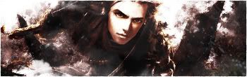
    Text border+text aren't good.
    Try duplicating the render's layer so it's more visible.
    Sharpen up some parts too, might look better that way.

  4. #4
    Join Date
    Jan 2006
    Location
    -E-Town
    Posts
    310

    Default

    wat can i do with the border, keep the C&C comin!! thanks static for the comment not to many people give them


    I Go by Homicide On Other forums

  5. #5
    Join Date
    Apr 2005
    Posts
    1,287

    Default

    The border box around the text he meant*

    lol, just remove it

    And make the text maybe on BOLD so you can see it more and add effects. just play around with it.

    And.... Your welcome!!

  6. #6
    Join Date
    Apr 2005
    Location
    Springfield, MO
    Posts
    1,736

    Default

    I don't know, myself I hate the color of the border on both the box and the sig, the orange stands out way to much. Just throw a basic black on one there for a border. That also goes for the text. I don't really think the font style fits and again the color stands out way to much IMO. Also the slashes don't really fit. After finding anew way to do the text then do want metal said.

  7. #7

    Default

    The box around the text doesn't really work for me..same with the yellow border like CK said. And sharpen the render.

  8. #8
    Join Date
    Aug 2005
    Posts
    299

    Default

    your best ever, remove the box, and set the text and the border to around 50% opacity, that way you'd have a really nice sig.

  9. #9
    Join Date
    Apr 2005
    Location
    NSW, Australia
    Posts
    1,511

    Default

    the quality of the render ruins it, but it's your best yet


  10. #10
    Join Date
    Jan 2006
    Location
    -E-Town
    Posts
    310

    Default

    thanks guys i'll post my result lata!!


    I Go by Homicide On Other forums

Posting Permissions

  • You may not post new threads
  • You may not post replies
  • You may not post attachments
  • You may not edit your posts
  •  
Powered by vBadvanced CMPS v4.1.1