GFXVoid Graphic Design Forum

Remove Text Formatting
Loading...

» Online Users: 26,370

0 members and 26,370 guests
No Members online

» Site Navigation

 > FAQ

» Stats

Members: 35,442
Threads: 103,075
Posts: 826,688
Top Poster: cc.RadillacVIII (7,429)
Welcome to our newest member, Lekelindids
Results 1 to 6 of 6

Thread: Latest

  1. #1
    Join Date
    Dec 2005
    Posts
    134

    Default


    how does these looks?

  2. #2
    Join Date
    Apr 2005
    Location
    NYC
    Posts
    4,253

    Default

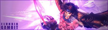
    The bg's are kinda plain and they're way too monotone, your current is pretty nice though.


  3. #3
    Join Date
    Dec 2005
    Posts
    134

    Default

    its not that monotone now

  4. #4
    Join Date
    Aug 2005
    Location
    HK
    Posts
    2,353

    Default

    ZAT IS BETTER THAN THE FIRST. uhuh, way better.
    the render on the first one doesn't fit and BG lacks depth..

    2nd one..yea. good, deserves a current imo.


    <3 Fuzzy

  5. #5

    Default

    2nd&#39;s good.Don&#39;t like the border though.Would be better if it&#39;s white, but who cares bout border?

  6. #6
    Join Date
    Dec 2005
    Posts
    134

    Default

    thx for the comments currented

Posting Permissions

  • You may not post new threads
  • You may not post replies
  • You may not post attachments
  • You may not edit your posts
  •  
Powered by vBadvanced CMPS v4.1.1