GFXVoid Graphic Design Forum

Remove Text Formatting
Loading...

» Online Users: 16,219

0 members and 16,219 guests
No Members online

» Site Navigation

 > FAQ

» Stats

Members: 35,442
Threads: 103,075
Posts: 826,688
Top Poster: cc.RadillacVIII (7,429)
Welcome to our newest member, Lekelindids
Results 1 to 6 of 6
  1. #1
    Join Date
    Oct 2005
    Posts
    159

  2. #2
    Join Date
    Apr 2005
    Location
    Scotland
    Posts
    2,177

    Default

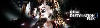
    I really like this sig. love how "death" is coming to get her plus love the lighting going up her face. the only thing i don't like and i know u haven't been good with is ur text mayb i dunno. also border tha shiz lol.

  3. #3
    Join Date
    Oct 2005
    Posts
    159

    Default

    ow ---- I've forgotten a border, yeh I've allways had probs with text but I'm still practicing on that.
    Thx for comments btw.

  4. #4
    Join Date
    Apr 2005
    Location
    Singer Island, FL
    Posts
    5,206

    Default

    Sexy as hell man, current it.

  5. #5
    Join Date
    Mar 2006
    Posts
    2,714

    Default

    that movie was the shit. i <3 the series

    and the sig is pretty cool

    also.. and i assume this was intentional.. i dont like how it is destynation not destination

  6. #6
    Join Date
    Jun 2005
    Location
    U.K.
    Posts
    3,462

    Default

    make the transition to black better and you hav a nice sig

Posting Permissions

  • You may not post new threads
  • You may not post replies
  • You may not post attachments
  • You may not edit your posts
  •  
Powered by vBadvanced CMPS v4.1.1