0 members and 527 guests
No Members online

» Site Navigation

» Stats
Members: 35,442
Threads: 103,075
Posts: 826,688
Top Poster: cc.RadillacVIII (7,429)
|
-
-

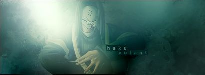
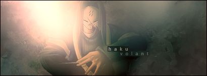
I like it, nice feel to it. Though, I don't like the bottom right and top left corners. I think you either need to fade to black/white (or near-white) more gradually or you need to tone them down a bit. As in, make the bottom right a bit brighter and the top left a little darker. They just seem a little too strong.
-
The light shouldn't be one big blob over his shoulder, it should be more defined rather than a blob. Add some more bg textures and sharpen them.
-
I really like this one, only thing you need to do (as mentioned above) is fix the lighting.
-
fix the lighting a bit, but I'm really liking the second one more than the first.
-
THe 2nd one is awesome! FIx lighting a bit and itll be sweet. Current it too 
Great stock
-
Thanks. ^^'
I fixed the things Jack mentioned, I think, but the huge blob would take some work to shrink...and I like it myself. I might work on it later though.
I'll also see if I can get back to the colors I had in the second one...
Anyhoo, haku: part deux, coming up.
EDIT: Fixing colors is easy when you remember the neat thing called 'layers'. -_-
 Posting Permissions
- You may not post new threads
- You may not post replies
- You may not post attachments
- You may not edit your posts
-
Forum Rules
|


 Reply With Quote

