0 members and 785 guests
No Members online

» Site Navigation

» Stats
Members: 35,442
Threads: 103,075
Posts: 826,688
Top Poster: cc.RadillacVIII (7,429)
|
-
-
-

 Originally Posted by Post

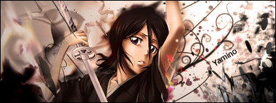
Yes, the biggest parts of this sig really works, but i don't like the smooth smudge or whatever it is 
I will also think about the black in the right corner
And remember light, i don't think your light is placed right
Lol, your comment rhymed all the way
Thanks for pointing that out.
Current

-
-
It lacks a good source of depth if you ask me. =/
Try using some gradient maps and blurring and sharpening for some nice depth and blending. And some of the effects on Rukia could be removed.
-
Two diff parts,what owuld say..smudge the right too and its win!

Go GFX viod!
 Posting Permissions
- You may not post new threads
- You may not post replies
- You may not post attachments
- You may not edit your posts
-
Forum Rules
|


 Reply With Quote