0 members and 896 guests
No Members online

» Site Navigation

» Stats
Members: 35,442
Threads: 103,075
Posts: 826,688
Top Poster: cc.RadillacVIII (7,429)
|
-
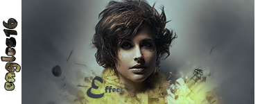
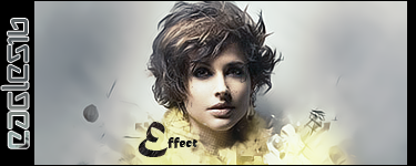
 effect effect
Last edited by eagles16; 11-30-2008 at 09:31 AM.
-
Good job eagles, I like the smudging, good effect for the effect sig ;o but it does seem a bit dark... well, a lot dark, try adding in some visible light, probably coming from teh left and making everything a little brighter in general with levels. Also... imo those borders are ugly, especially cause they are a bright color (white oh em gee) around a dark sig and creating a big distraction. I like cinematic borders moar... 
Brighten it up and change the borders (imo) and it'll be a kick ass sig good work

Et Tu?
SilentShadow | Jorrne | Arcmenis | Garis | Splinter | Sanbu | DeadlesS | Tekken | Proflax | Suddu
-
-
-
I must say i kind of dislike both of these.
first of all shes got a severe case of floating head syndrome. Add more nexk in ther emaybe a shoulder or so! i want to see something supporting thast gigantic head.
V2, V1 is wayy to dark. But everything is blurred. Why? sharpen it a bit so it's not so blurry.
WHats witht he border and the text on the side too? I dislike them both. Delete them all.
 My DevART
RATCHET is my bitch
Andrew says:
u ever stolen a bible?
Apathy says:
no
used the last two pages to roll a joint though
Andrew says:
wow
thats fucking hard core
^^HAHAHA, dm sucks XD
Similar Threads
-
By bonez07 in forum Support
Replies: 5
Last Post: 09-03-2008, 07:14 PM
-
By the_modern_day_houdini in forum Support
Replies: 3
Last Post: 07-10-2007, 06:48 PM
-
Replies: 5
Last Post: 03-13-2006, 02:49 AM
 Posting Permissions
- You may not post new threads
- You may not post replies
- You may not post attachments
- You may not edit your posts
-
Forum Rules
|


 Reply With Quote

