0 members and 493 guests
No Members online

» Site Navigation

» Stats
Members: 35,442
Threads: 103,075
Posts: 826,688
Top Poster: cc.RadillacVIII (7,429)
|
-
 Tekken C'n'C plz Tekken C'n'C plz
A quicky:

How can i improve it? 
 Christian "fluffen" Svensson
-
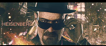
Whoa. I nearly thought this was one of Jorne's sig. The smudging is very consistent menz. I like it. However, it is the only thing I'm seeing. The left side of the sig is extremely bare, excepting your text. Should resize the render in my opinion. Add some effect c4ds in the left side and you're set. A little splatters could as well. Add some more flow you know.
 Originally Posted by Slave
takken, you sweet boy you, i could eat you 6^
-
It's all smudging!
This can be a good thing and a bad thing. In a smudging sig the focal is generally smaller to allow for more visibly appealing smudging, and it's generally done with a sense of flow and direction in an attempt to create an effect. This seems to be just... smudging to create a background. If that's the case, you need more effects.
Try c4d's or brushing to help there, clipping masks are a wonderful thing.
Lighting isn't bad, but at the source its a bit bright imo
There's some depth there
Try checking out some of Jorrne's sigs, he's a smudger for life.

Et Tu?
SilentShadow | Jorrne | Arcmenis | Garis | Splinter | Sanbu | DeadlesS | Tekken | Proflax | Suddu
-
-
You should add more flow, as the others have already said. The smudging is good but its a bit repetitive and it looks the same. Change it up with some more effects.
-
A little too much smudging and not enough effects.
A bit bright and the text is too big and eye-catching.
Keep it simple with the text.
I would read some of the sig tut's in the Signature Tutorials Section.
Good blending overall, but there is too much smudging!
Originally Posted by MarkPancake

MarkPancake banned.
Success.
-
since you called me, i'll cnc lol XD
as said above, you over smudged it and it became realy flat, which is bad for blending.
try keeping your smudges smooth and creat some flow.
also that random are in front of his face is a bit too bright.
lol i cant comment on text cos i cant do any better.
Similar Threads
-
By Takken in forum Sigs & Manips
Replies: 10
Last Post: 05-28-2009, 09:53 PM
-
By Saby in forum Sigs & Manips
Replies: 1
Last Post: 08-30-2008, 08:22 AM
-
By Garis in forum Sigs & Manips
Replies: 10
Last Post: 10-12-2007, 10:01 AM
-
By PP Bone in forum Sigs & Manips
Replies: 5
Last Post: 07-10-2005, 04:16 PM
-
By Ako. in forum Digital Art
Replies: 7
Last Post: 07-04-2005, 07:13 PM
 Posting Permissions
- You may not post new threads
- You may not post replies
- You may not post attachments
- You may not edit your posts
-
Forum Rules
|


 Reply With Quote