GFXVoid Graphic Design Forum

Remove Text Formatting
Loading...

» Online Users: 21,827

0 members and 21,827 guests
No Members online

» Site Navigation

 > FAQ

» Stats

Members: 35,442
Threads: 103,075
Posts: 826,688
Top Poster: cc.RadillacVIII (7,429)
Welcome to our newest member, Lekelindids
Results 1 to 6 of 6
  1. #1
    Join Date
    Jun 2009
    Location
    Bracknell, England.
    Posts
    766

    Default Assassin's Creed

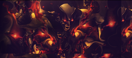
    I'm gunna take a step back. It's been a while since i've used an origional AC render and its been a while since i made a proper sig that wasnt just a doodle cos i was bored.


    Spent about an hour tinkering with it.
    CnC and ways i could improve it would be nice


  2. #2
    Join Date
    Sep 2009
    Location
    The Netherlands
    Posts
    1,732

    Default

    I really like this
    Nice depht, Good lightning, Nice text.
    nothing more to say really
    KIU


  3. #3
    Join Date
    Oct 2009
    Location
    Germany
    Posts
    168

    Default

    I like the "soft touch" of the sig. But it hasn't got any "wow-effect", a little boring... but I like it.

    Newest


  4. #4
    Join Date
    Jun 2009
    Location
    Bracknell, England.
    Posts
    766

    Default

    i didnt want to put any "wow-effects" in cos i'm crap at them atm = p
    This time i went out to make a decent sig for myself and i think i've done ok. If anyone knows any good "wow-effect" tutorials plz link them ^^


  5. #5
    Join Date
    Dec 2009
    Location
    Russia Federation
    Posts
    600

    Default

    it's overblured for me
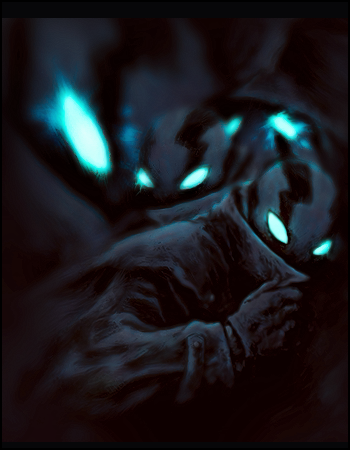
    Club Claro Member Signature (made by myself):


    My last signature:


    Gift from Radillac:


  6. #6
    Join Date
    Jun 2009
    Location
    Bracknell, England.
    Posts
    766

    Default

    This may be a stupid question but have u never played the origional Assassin's Creed? The Animus (what this sig's BG is based on) is a very misty and Technological envinronment before entering a memory. That is what the right and left sides are, its so blurry because they drift off into the background and its not possible to make the close numbers and lines sharper without making them over sharpened because as u see them now is how they came as the screenshot


Similar Threads

  1. Assassin's creed tut
    By annihilator in forum Signature Tutorials
    Replies: 40
    Last Post: 05-02-2010, 04:15 AM
  2. Assassin's Creed
    By Silverwolf in forum Sigs & Manips
    Replies: 7
    Last Post: 07-06-2009, 02:41 PM
  3. assassin's creed
    By YaminoSoul in forum Sigs & Manips
    Replies: 5
    Last Post: 11-28-2008, 02:57 PM
  4. Assassin's Creed
    By CyBeN in forum Sigs & Manips
    Replies: 7
    Last Post: 03-20-2008, 06:47 AM
  5. Assassin's Creed Sig
    By Sandstorm in forum Sigs & Manips
    Replies: 7
    Last Post: 02-19-2007, 05:35 PM

Posting Permissions

  • You may not post new threads
  • You may not post replies
  • You may not post attachments
  • You may not edit your posts
  •  
Powered by vBadvanced CMPS v4.1.1